It’s time for pillow talk. Right now, the new hotness in the pillowcase world – and the anime world in general – is the Kantai Collection, further proof – in case anyone needed it – that you can slap a pair of big eyes and tits on any concept and it will sell. This pillowcase, however, is a bit older, having been releaased in 2012. I thought about picking it up at the time but passed on it. A while later, I began thinking that that was a mistake, and started looking through the usual secondary market sources to see if I could amend the error. Fortunately, the circle who produces this dakimakura cover occasionally restocks out-of-print pillowcases, and so I was able to purchase this cover.
This pillowcase is distributed by Stylus, who also produced the Somei Yoshino dakimakura cover. Both were illustrated by Carnelian, one of the better-known and longest-tenured artists in anime culture. She’s done several pillowcases for Stylus, generally featuring characters who are named after vegetation and are (nominally) clad in clothing patterned after traditional Japanese fashion. That is the case with Kinmokusei, whose name is the Japanese term for the osmanthus plant.
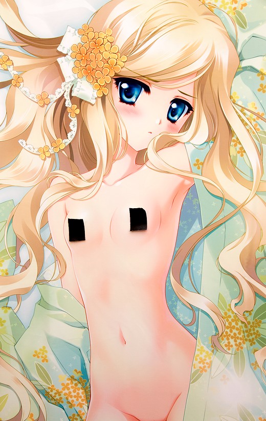
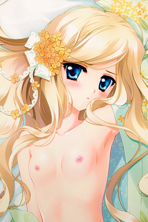
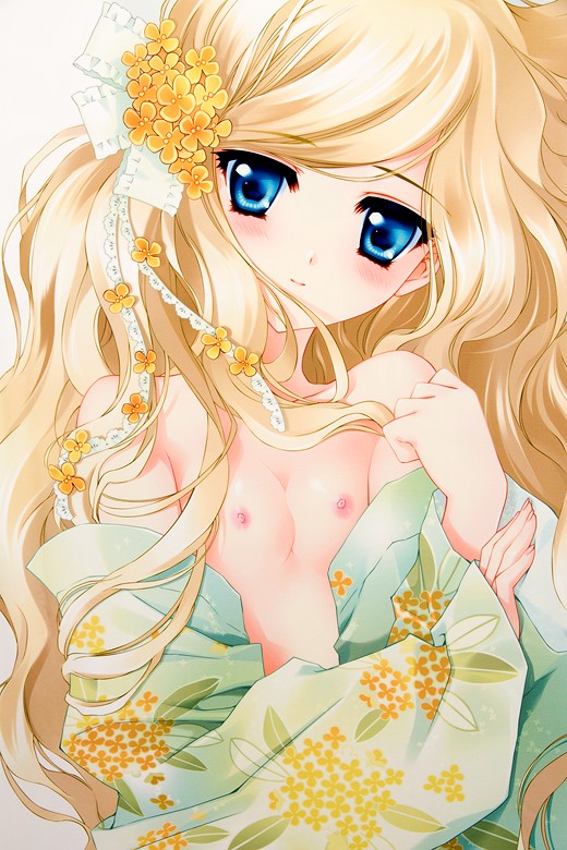
The front side of the pillowcase shows Kinmokusei wearing a neutral expression and not much more. Hallmarks of Carnelian’s style are easily recognizable, particularly the very large eyes, the indistinct pupils, and the prominent eyelashes. It’s the sort of style that, although it’s not enormously different from most anime-style artwork, reminds me of the way artists drew in the 1990s – though perhaps that’s just because she’s been in the business for so long.
Kinmokusei is a bit unusual in that she has small breasts but isn’t completely flat-chested. I think it looks quite appealing in that it doesn’t make her look like a loli. Not that I am against loli characters in anime-style art, but I generally prefer older-looking characters.
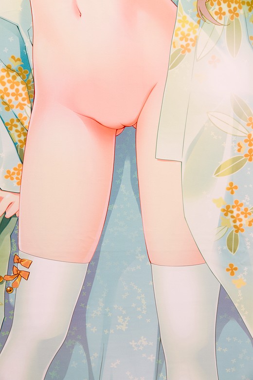
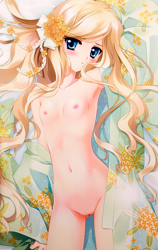
While this dakimakura cover obviously features nudity, the genitalia aren’t nearly as detailed as they are with some other pillowcases.
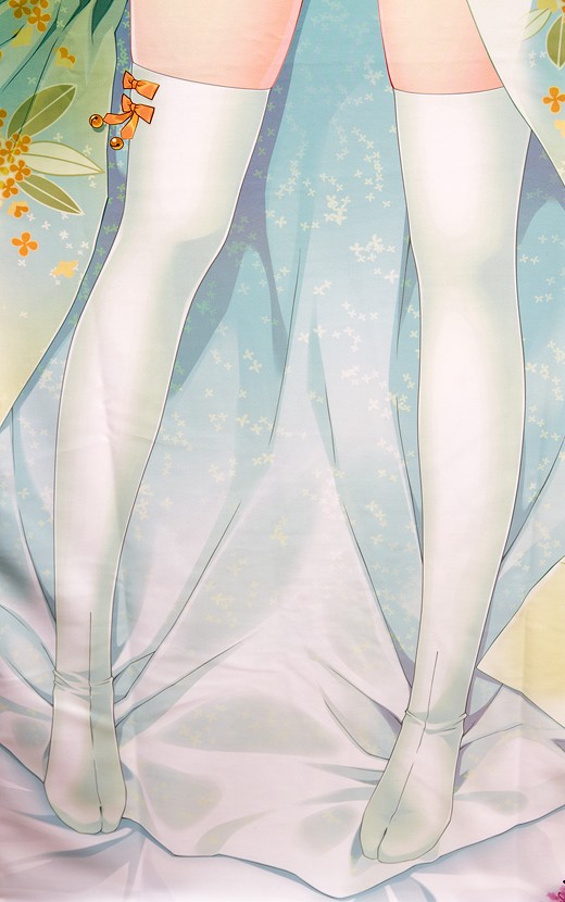
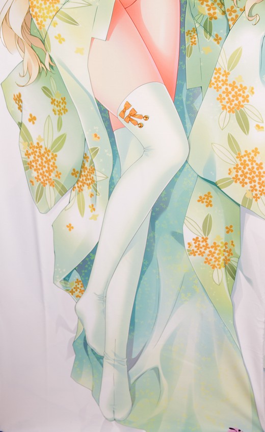
I really like the combination of the traditional two-toed tabi style with thigh-high socks. It obviously reinforces the Japanese-style sensibilities of her design, and I think the juxtaposition of that East Asian aesthetic with a blonde-haired, blue-eyed girl is very attractive.
The reverse side shows the character flashing a friendlier expression while wrapped up in her kimono. It’s a very cute image, though a bit lacking in explicitness.
The green color of her clothes complements her hair color very well, I think.
Overall, I really like this pillowcase a lot. I prefer the front side, since I like her little frown, and I also prefer her pose. However, both sides look great; I’m a fan of Carnelian’s artwork and almost everything she draws is great.
That includes her next dakimakura cover, which also features Kinmokusei. She’s wearing less and has a different hairstyle, slightly reminiscent of Anaru from AnoHana. It’s also very cute, and it looks like she’s a little older than she is here. That may just be my imagination, though.




Despite liking a lot of her designs, this is one of the few Carnelian covers that I actually own; I own some of her older work, but not much of her newer work. I missed out on some really good ones, like Lucrezia, but I think I made a good choice. If given the option to choose one cover from her entire catalog to make my own, I think this would be a strong contender for first pick. Thanks for linking the new version, I think I might pick it up. I’ve been browsing the Stylus store a lot the last few weeks, and saw all the older items that they had stock of, so I missed that there was a new cover entirely.
Heh, KanColle actually looks like the type of game I’d play. I tried to sign up, but DMM is picky about what they let foreigners access on their site, and when I tried using a JP based proxy I ran into some compatibility issues. It’s crazy how quickly it became so popular, but I guess it shouldn’t be surprising. Of course it’s selling like crazy, but I’m fine with it since there are some very good looking characters to come out of the project. I’m really excited about the two B&W Store collaborations going on right now, one of which is featuring KanColle (the other is Puzzles and Dragons, which I have played quite a bit of.)
Yeah, I think I feel the same way; for me, it would be this one or Lucrezia, I think, although I really do like the Somei Yoshino pillowcase, too. I really do like her art a lot; besides the obvious aesthetic appeal, it always reminds me a lot of the 1990s/early 2000s style, which is sort of when I really got into anime. Misaki Kurehito’s style kinda has the same effect, too.
I’m really perplexed as to how it got so popular so quickly; I mean, the characters are pretty cute but then, visual appeal is very much the norm rather than an outlier in anime style. Being a big naval history buff, I’m vastly amused that they are all named after IJN warships, and even more amused that most of those ships got blown out of the water by the US Navy. I’m still a little disappointed that there aren’t more pictures of the characters, uhh, interacting with foreign powers.