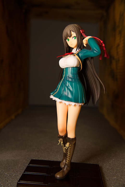
It can be difficult to come up with an attractive way to shoot a figure like this. Satsuki isn’t exactly what you would call exciting or dynamic, but she does have the advantage of having an unusual backstory. That led to the idea for the main shoot, which was to put her up on a stage with a big election banner behind her. It didn’t turn out as well as I had hoped it would, as is often the case when I haven’t thought things through. This time, I didn’t adequately account for the glare coming off the background, and the wood panel serving as the backdrop doesn’t look that great, either.
When I photograph a figure, I often try to use at least two ideas. This lets me inject some variety into the post (albeit at the cost of consistency) and more importantly, it gives me a fallback option in case one idea doesn’t pan out. It also gives me the opportunity to do something unusual, unexpected, and in many cases, to learn to do something I’ve never tried before.
The Concept
In Satsuki’s case, I was originally inspired by a picture that I saw in Joe McNally’s recent book Sketching Light. There’s four pictures on that page but the one that stood out to me is the one in the lower right corner, where a woman (yes, that’s a woman) is standing in what appears to be a small, delapidated room. As anyone who has seen my pictures can guess, I like scenes depicting desolation, atrophy, and ruin. (It’s not just me; Thom Hogan wrote a post pondering why photographers enjoy photographing decay.) I felt that Satsuki’s worried face – with her frown and furtive sideways glance – and such a scene would complement each other well. My major concern was that the disparity in tone between the election banner pictures and the dark, ruined room pictures might be jarring when combined in one post; however, for better or for worse, this website is a review website, and the presentation of photography takes a backseat in priority to the framework of the review.
The Set
I wasn’t sure how I would go about lighting the figure in a scale-size room; controlling falloff would be difficult, particularly if I wanted to use softer light than I could achieve with a snoot or grid. One obvious solution – though it took me a while to think of it – was to substitute a tunnel for the small room. This alternative also had the benefit of vaguely resembling a certain scene in the Gaspar Noé film Irreversible (I showed a final picture to a friend and mentioned that I was thinking of that scene, and he said that was the first thing he thought of as well).
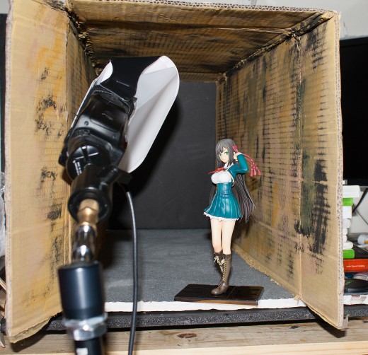
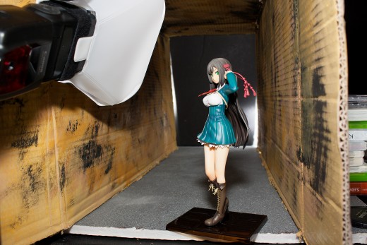
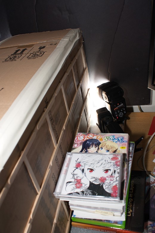
The best benefit of using a tunnel was that it was very easy to construct. It’s literally just a cardboard box; I blotted some yellow and black paint on the interior to simulate dirt and grime and spray-painted it with some yellow spray paint (bought for another idea that never got off the ground). The floor is a sheet of foamboard painted with some textured spray paint; I’ve used it for around a dozen figure reviews in the past year. The background is a sheet of black foamboard.
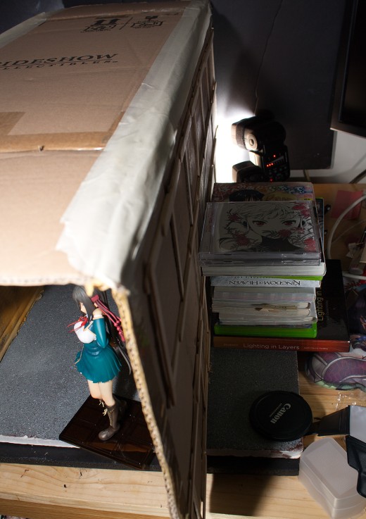
I did need to use a stack of DVDs and ero-manga to hold the whole thing up.
Gear
Anybody with an interest in photography knows that an inordinate amount of attention is paid to equipment. A quick survey of various gear forums, the Canon and Nikon Rumors sites, and DPReview will bring the observer into contact with some of the most deluded, hyperbolic, and reactionary camera-users on the internet, people who seemingly value megapixel counts and MTF scores over the content of images. It is no surprise that an opposing philosophy has thus developed, purporting that the photographer is the one who makes the picture and that the equipment used are merely tools. This doctrine is an attractive one, partly because it is largely correct but also, perhaps, because of the suggestion that a beginning photographer need not spend much money on equipment to get excellent results.
As appealing as this philosophy may be, that implication also makes it dangerous. It is pleasing, maybe, to imagine that images spring directly from the mind of the photographer straight into the memory card – but that isn’t how it works. Gear plays a role – a huge role – in the look of a photograph, and a photographer needs to know how to use one’s equipment to realize one’s intention. Furthermore, a photographer needs to know what capabilities one is missing due to a lack of equipment. It is right to dismiss the photography zeitgeist’s obsession with sharpness, microcontrast, megapixels (unless one really is printing that large), and even sensor sizes (to a certain degree). However, one should not avoid examining what one’s options are when it comes to designing a photograph, and equipment plays a vital role in making those options available.
If you follow photographic message boards, you will inevitably come across people who have just acquired their first DSLR (or other interchangeable lens camera) and are soliciting lens recommendations. If they say they are interested in taking portraits, invariably somebody will say that a telephoto lens – something in the range of 85mm to 135mm – is a “portrait lens” but for an APS-C camera, a 50mm lens is close enough.
This is not bad advice, generally speaking, but it ignores a crucial bit of information: namely, what kind of portraits is the photographer interested in taking? What if the photographer is interested in taking full-body portraits? Or what if the photographer wants to get into environmental portraiture? By simply ceding one’s choice of lens to the community, the photographer is making two mistakes: one, the photographer is admitting that he or she has no idea what sort of picture he or she wants to make, and two, the photographer is letting the gear dictate his or her creative options when it ought to be the photographer who makes those decisions.
When I thought of what kind of picture I wanted to take of Satsuki in a tunnel, I imagined the tunnel being dark, long, and narrow. I wanted the scene to be foreboding and ominous; I wanted a feeling of disquiet to suffuse every aspect of the picture.
Unfortunately, as I’ve recounted numerous times here, I don’t have a lot of available space and that precludes constructing a long tunnel. However, the set design gave me an opportunity to try out something that I’ve been wanting to try for a long time. I’d been interested in experimenting with perspective to alter the perception of depth in my images, but I didn’t have the equipment to do it. I typically only use two lenses: a 100mm macro lens, which typically compresses perspective in my photos and thus is not of much use in establishing depth, and a 35mm lens, which can exaggerate depth but doesn’t focus closely enough to be useful for that purpose unless the figure is a large one. I had planned on picking up some extension tubes but since I hadn’t yet come up with an idea that this technique would be useful for, it wasn’t a high priority for me.
A couple months back, I went looking through Amazon and found a set of 72mm close-up filters manufactured under the Vivitar name. Close-up filters reduce the minimum focusing distance of a lens at the cost of some optical degradation and the removal of infinity focusing capability. I’d actually experimented with close-up filters way back in the early days of this website; the first – and only – time I used them was to photograph Kotonoha, back when all I had was an 18-55mm kit lens and a 50mm f/1.8 prime. The results were terrible; I spent most of the evening after that shoot cleaning up chromatic aberration problems. However, the 72mm filters weren’t too expensive, and the lenses I planned to fit them on were better; I figured that if they were good, I’d save myself the expense of buying autofocus-compatible extension tubes, and if they weren’t good, I could still probably salvage the pictures in Lightroom and Photoshop.
Not only does my 35mm lens take a 72mm filter, my 15-85mm zoom lens also takes that filter size. This was serendipitous because that’s the only really wide angle option I’ve got. I used to use that zoom lens exclusively, but I haven’t used it much over the last year and a half, principally because I started subscribing to the ideology that primes are always better than zooms. However, it came in very handy here because of the specific look that I was trying to achieve. Here’s how focal length played a critical role in designing this image.
At 100mm – the focal length I most often use for photographing figures – you can’t even tell that Satsuki is in a tunnel. The background – a sheet of gray foamboard in this test shot – looms large. There’s nearly no sense of depth in this picture, and Satsuki doesn’t even fully fit into the frame.
At a focal length of 35mm, both sides of the tunnel barely appear. The gray foamboard background is still a very large element in the image.
At 24mm, the roof becomes visible, and the diagonal lines of the tunnel are more pronounced. The foamboard background looks smaller, even though Satsuki herself is not much smaller than she is in the previous picture.
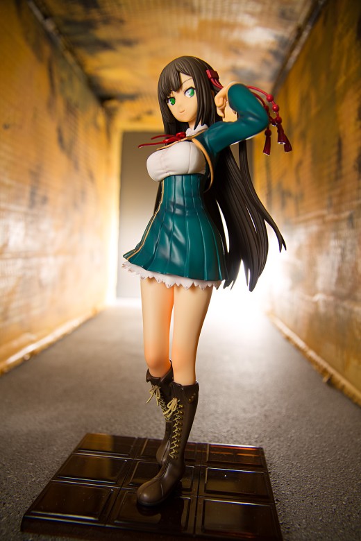
At 15mm – the widest that my lens can zoom out – the tunnel appears to stretch towards the background and the sense of depth is much more evident. Note that Satsuki herself is about the same size as she was in the previous image, even though the appearance of the surrounding elements is vastly different, even ignoring the test lighting firing off on the backdrop.
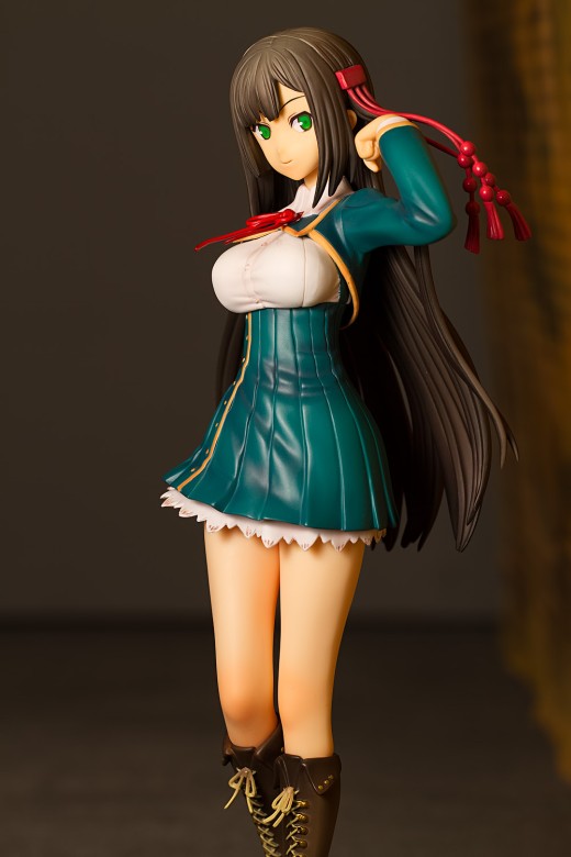
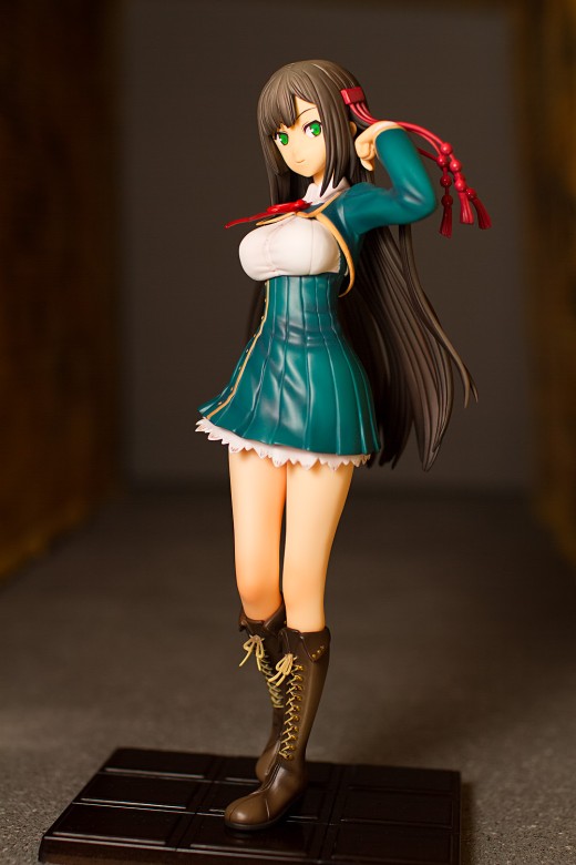
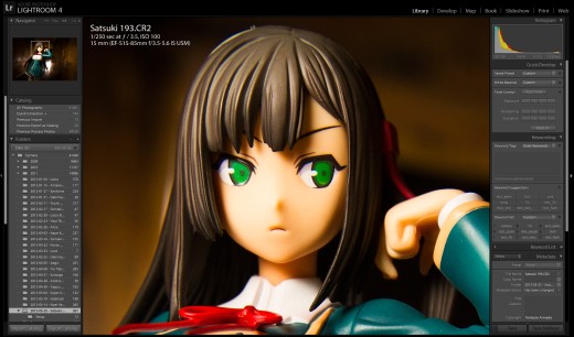
Being used to prime lenses, I was concerned that image quality with the 15-85mm zoom would be less than what I’m used to. However, looking closely at the pictures, it doesn’t seem to have been an issue:
For a picture shot with a consumer-grade zoom wide open through a cheap, off-brand close-up filter with no output sharpening applied, I think that it looks pretty good.
Lighting
The lighting setup is fairly simple; Satsuki is lit by one flash unit. It’s fitted with a LumiQuest Ultrasoft here, though I also used their little Mini Softbox. There’s not really enough space to control the light here, though I could have flagged off the edge with a long strip of black tape.
The background lights – the hard lights at the end of the tunnel – are generated by a few flashes piled up near the black foamboard background. The tunnel is offset from the background by an inch or so to allow that light to bleed into the image, giving a bright and eerie glow. These flashes are triggered via their optical slave sensors; there’s one other flash outside of the tunnel acting as a relay so that when the key light fires, it sends its own light pulse towards the background, and that pulse triggers the flashes placed at the end of the tunnel.
Post-Processing
These images require quite a bit of tweaking in Lightroom. Quite a few people view post-processing as a chore, but I often find it relaxing, and I think I’ve gotten a decent handle on Lightroom now.
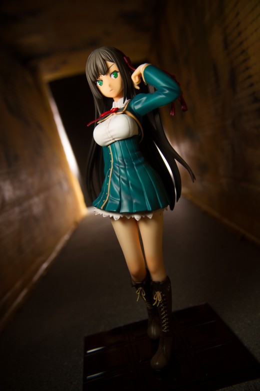
Here is one image from the set, before processing; I like how it looks but it needs a lot of work and one major fix. I want the corridor to be dark, so that means a big boost to contrast and a drop in the shadows value. To darken the tunnel, I applied a big vignette to the picture.
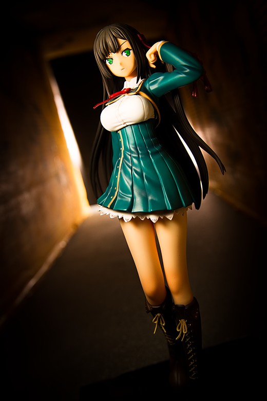
The other major change I made to the image was to jack up its color temperature. I wanted the photo to have a warm, oppressive feel, and I wanted the lighting to look unnatural, as if the tunnel were lit by sodium vapor lights. I took this a step further in the header image of this post by using Lightroom’s split-tone function to give the image a reddish hue.
The picture also required some distortion correction; her head is visibly stretched vertically. Lightroom’s lens correction tools makes fixing this problem a straightforward task.
This picture was shot with the camera tilted; I used to do this more often, back when I was completely clueless and thought that it was a good way to make my pictures look more exciting. I don’t do this as often now since I know better, but in keeping with the idea that these pictures should look unnatural, I decided to tilt the camera. The problem with camera tilt is that it looks like your subject is falling off of the planet; this is particularly true when the scene is otherwise tranquil. Another problem is that every beginning photographer’s guide suggests tilting the camera as a way of injecting artificial excitement into a picture (I think I got this suggestion from one of Scott Kelby’s Digital Photography books, which are very much beginner’s books). That means that everyone who starts dabbling in photography tilts their pictures at some point, even when it does nothing for the image. Here, I think it emphasizes the diagonal lines of the tunnel, so I’m comfortable with it.
The final image looks like this, which I’m pretty happy with.
Wrap-up
This shoot was entirely experimental and I wasn’t sure what the results were going to look like. I can see a few areas that could be improved upon: one thing that I would change is the construction of the tunnel; I think it’s a bit large for a 1/8 scale figure like Satsuki, and I would prefer to have made it narrower, with a lower roof. I do have another 1/8 scale figure that I’d like to shoot with this set, and I’m interested in seeing what those modifications will look like. I also could’ve moved Satsuki forward an inch or two, and that would’ve given more depth to the picture.
On the plus side, the pictures turned out better than I had expected them to and I got some new ideas for shooting some other figures in my collection. I also gained a new respect for my 15-85mm lens, which should be useful for filling that big gap between the 35mm and 100mm focal lengths that I use. As an exercise, I subsequently photographed one of my bondage dolls with the lens and was very impressed with how well it rendered the subject. (I suppose I should mention that link is not safe for work.) I have to admit I’m now more than a bit interested in picking up an APS-C wide-angle zoom now, though the prudent thing to do would be to rent one first.



As always, I thank you for the breakdown and insight in to your thinking and methodology. It’s useful to those of us who want to learn a bit more about photography.
The perspective differences you have here are particularly interesting. I primarily use 90, 50 and 35mm primes for my figure shooting; I’ve strongly been considering getting Pentax’ famed 15mm, but I could get Sigma’s 10-20mm for around half the price, though obviously it loses that prime quality, it allows a bit more flexibility.
My photography desk is still covered in riser and figure boxes because I’ve been procrastinating about moving furniture to fit my new display case, so I haven’t done anything for ages (not to mention Tera absorbing much of my time) but I really do need to do more shooting. And as always, your figure shots and breakdowns are quite inspiring.
Especially seeing how relatively easy it is to do a rather interesting shoot for very little cost. Though I’m still waiting on my photography teacher to get back to me about some figure shooting. I asked him if he’d show me how he’d go about shooting a figure (he’s seen photos, no figures in person though) and he’s asked one of his sons to do some props; he does staging for advertising, apparently. So hopefully I can get some more interesting stuff going on. I think that’s part of why I have been lazy about photography lately, is just using the same coloured card backdrops is really boring and it feels like there isn’t much point.
But regardless of what props and materials I may end up with, I will never be as devoted to it as you are; I do loathe post processing, even to the point of after taking a few dozen shoots of a figure, I just pick the best two or three from the card to actually open in PS and tweak contrast (if that), resize and upload to the net. Far from the hundreds of shots you actually process. I just don’t have the patience. ;.;
That’s why I just post one or two pictures of a figure as a “hey, this is what it looks like.” sort of shot, instead of trying to do any sort of real reviews and showing off the figure and my opinions in depth. Hell, some of my figures I haven’t even taken photos of, because there are already dozens/hundreds on MFC and people can look at them all they want. No point in adding my mediocrity to the pile.
You are welcome! I still plan to write more posts of a more general nature, though I haven’t yet gotten them drafted. I have a bunch of notes jotted down in Evernote for posts and I will have to gather them together into cohesive articles one of these days.
Perspective manipulation is something I’ve kinda tried to do in the past, and I think I’ve mentioned wanting to explore it in greater depth, but this is the first time I’ve really tried to use it as a major factor in the design of the picture. I recall saying that I wanted a 35mm macro lens since my current 35mm lens does not focus very closely, but now I’m sorta interested in Tokina’s 11-16mm f/2.8 zoom. Problem is, it’s one of the lenses known to have some autofocus anomalies with the 7D body (I know you are a big fan of third-party lenses, but this sort of issue is why I am wary of them, at least with my main equipment), though I think I remember hearing that Tokina is updating it. There’s also the larger issue that I’m not likely to use this setup that often, and there’s not much use buying new equipment for a shoot that I’ve already completed (humorously, there was an article at TOP just a week or two ago talking about this very issue).
You should definitely do more shooting. Getting better is really just about shooting a ton. There was a quote from Ira Glass in a book I was reading that – paraphrased – goes something like, “You’re going to make a lot of crap in your first couple of years and you know it’s not as good as you want it to be, but you have to go through it before you start making anything special. Do a huge volume of work because it’s only by actually going through a volume of work that you’re actually going to catch up and close that gap.”
The funny thing is is that I’m planning on going back to colored card backdrops, or similarly simple backgrounds. I shot the doll photo linked above on a sheet of gray foamboard and I was very pleased with it. Lately I’ve really been taken with Dan Winters’s style – he gets talked about a lot on Strobist and I recall there was a discussion of one of his images on the Strobist Flickr group a while back – and that’s something I’m planning on experimenting with. He does have some incredibly complicated backgrounds – if I remember right, his photo of Helen Mirren was taken on a set he fabricated rather than on-location – but I think his pictures shot on mottled gray backdrops are just as effective.
I was just looking back at when your last shot breakdown was as I thought it had been a while, and noticed I never replied to you here, so here’s a belated one!
Firstly, do more photographic focused posts. Just sit down and sort your notes out and come up with some stuff, surely won’t take as much time as all the PPing you do. =p
I’m not a “big fan” of third party lenses, I’m just open to them. Most of my lenses, and all of the lenses I am considering for the future, are on-brand. Though that is also partly due to the fact Sigma and Tamron make no K-mount lenses at the moment — since Ricoh have bought Pentax and are revitalising the brand from Hoya’s stagnation, they’re trying to rebuild bridges with third parties, so it may change in the future.
But I’ve mostly been weighing up between a 15 or 21mm wide, and a 200 or 300 tele. Two extremes, I know; neither really for figure shooting, though wides, as shown here, certainly have a use in figure shooting. The compression stuff you explain really does interest me, and it’s something I had never really paid much attention to in the past, though something I had vaguely experimented with since reading this article a few months ago.
I know I simply need to shoot more, and I have been; over a thousand shots in the past two months, which is a pretty big increase for me. Though I still discard many, so I guess I’m not improving that much, my keeper rate has improved a little. I used to do 20-30 shots to get two or three I liked, now I can get a couple keepers in five to ten shots.
My camera is nearing on 4000 actuations after a bit more than a year of owning it, and I’ve kept about 600 of those, though some are certainly not good, I am keeping a record of where I started to compare with how I am now, and where I’ll be in the future.
I’ve just borrowed a light meter from my photography teacher I’ll play with to try to understand light a bit more. I want to get a better eye and mind for photography and not rely on my equipment so much, as it will help me just set up and shoot and not discard as many shots while setting up, and playing with the light meter may help with that. Lighting is definitely what I struggle with most, which is a drag because it is pretty much what makes photography. So not having a good grasp of it generally leads to suck and fail.
Your shots are always inspiring, though, and these breakdowns help me understand things a bit better; I just need to learn to extrapolate your flash lighting to the natural and lamp lighting I use.
Writing is one of the most time-intensive parts of running this website. I can typically post-process 30 or so images in about an hour or so, and writing a figure review usually takes a couple hours more. Writing a preorder outlook post usually runs me three to four hours and a long-ass post like this one can take closer to five.
Suck and fail is fantastic. Failure is one of the best things you can go through as a photographer or in any other creative endeavor, I think. My pictures are full of failure, and I’m fine with that. Almost everything I’ve learned about taking pictures came about from an ongoing process of failure. Failure gets stigmatized way too much, and I have the sense that a lot of people, particularly beginners, are afraid of failing (or they don’t realize they’re failing. I see that a lot.). Failure is great. People should try to fail more instead of taking the same sort of pictures over and over.
I think my Lightroom catalog has around 40,000 photos in it. I’ve been gathering some pictures that I want to put into a photobook (which I wrote a little bit about around a year ago, I think). Of those 40,000, I’ve identified 21 photos that I like enough to publish. I’m hoping to be able to get to around 40 or so, and I’m concerned that it might take me a couple more years to get to that number.
I know I need to fail to learn to get better; I used to draw before I became a cripple, and that’s a slow road, too. Photography is a different beast, though. Primarily due to light.
A large part of the slow crawl to improving is useful criticism and advice is hard to come by. The majority of the photographic community talk about gear, just say “oh get more flashes” or whatever, instead of giving any useful advice on technique. Uploading to “social” sites (most of my figure shooting goes to MFC) generally leads to no feedback (images lost in the swarm) or people just saying useless stuff like “IS SEW KAWAII” — which is fine they like the pic (though more often just the subject with no attention paid to the composition or anything) but useless for trying to develop as a photographer.
Yet, as I said about the gear, actual photographic communities are the most wretched hives of scum and villainy on the internet. I’ve been a part of many, many communities over the years, pre-dating the web boom, from gaming to work related and all sorts in between, and never seen nearly as much blind hate and vitriol as what comes out of photographic communities.
Which is why I opted for local classes, and met my teacher, who I still see from time to time, though he usually ends up just talking about all sorts of random things, I’ve not had any solid, real lessons, and he doesn’t look at and critique my photos, which I think is what I need.
I’ve been considering buying a new domain (not had one for years) and making a site similar to this one, though I really loathe web development and doubt I could even set up wordpress like you have here. Plus getting people to visit and comment would be hard; I came here because of some amazing photos you posted on MFC (Dizzy, iirc) but actually finding people who know photography to give useful advice, input, feedback and criticism is a big ask, without stepping in to Mos Eisley and just trying to ignore the hate (that I primarily receive due to using Pentax, but plenty of other loathesome stuff too).
How have you done it?
Hey Tier- nice post on this one. Nice use of LR. I’m loving LR more and more- and haven’t played with all the tools yet. I’ll have to give split tone a go. Really liked how you were able to make the base disappear by vignetting it.
Thanks! Admittedly, split toning is not something I do very often – in fact, I think this was the only time I’ve ever used it with a color image. I’ve used it more often to tint black-and-white images.
I am glad that you did a shot breakdown from that review. I commented before on how I really like how you did the tunnel and it is great to see how it actually came together.
I am not a photographer, but found the section about changing focal points extremely interesting. I was really surprised that the back wall moves so much between the focal lengths without actually moving anything.
I really enjoy seeing these breaks in the reviews, especially on the stuff you have tried that was new (ie Append Miku, this).
Thanks, I enjoyed writing this one, though it came out way longer than I thought it would. I do kinda want to talk more about photography on this site, since reviewing figures can be sorta dry and mundane (and also very subjective), though I haven’t yet quite reconciled how I want to pair up general-audience photography tips with doll and figure porn. It’s sorta curious how there are not many resources for scale figure photography on the internet, even though there are a helluva lot of people taking figure pictures.
I’ve grown to enjoy the post processing part of photography. Also, I’d never used close-up filters…if I ever get the desire to go back into photography I’d give those a shot. For the internet or anything less than 11×14 I don’t think the degradation in IQ would make me cry, particularly if it’s an image I’m going to vignette anyway.
Anyway, I think the effect was good and accomplished very economically, of which I’m always a huge fan.
I’ve spent a lot of time over the last year trying to improve my post-processing routine; switching over to Lightroom as my main image editing software made a big difference and I wish that I had switched over earlier (or at least, I wish I had used Canon’s DPP software earlier, which I had initially dismissed as being lightweight and insufficient, but it’s really quite a capable program). I don’t think I do a ton of editing compared to what I’ve seen done by photographers in other fields, but I think that post-processing makes a major difference in how my pictures look, and that in itself justifies the time I spend playing around with my photos.
I’ve also come to enjoy the workflow aspect of digital photography; I’ve been working on an organization system for my photos and implementing a backup method. It’s sort of a dry subject but it really appeals to the techy side of my background.
I kinda wish I’d bought 77mm filters and just gotten a step-down ring; I’m going to feel a bit silly buying multiple filter sets of different sizes to accommodate my lenses (I’ve got some really cheap lenses I got to use with a film camera, just to play around with). At some point it’s going to make sense just to get that extension tube set instead.
Very good composition man.
Thanks man!
Ah that’s interesting since I liked the review pictures of Satsuki. Haha well, I actually thought that you’ve put a lot of effort into the tunnel and now it turns out as “grungy” cardbox, the illusion was well done Tier 😉
For me postprocessing is always a part of my workflow and I also like to do it, sometimes I just get rid of the noise, sometimes I change a few more settings to get the look I wanted to create in the picture.
I did put in a lot of effort! Though a lot of it was building some bracing to keep the cardboard straight; I glued together a ton of popsicle sticks to stiffen the cardboard so that it would buckle when I painted it. I don’t think it was necessary though, since the cardboard seems pretty stiff (a lot stiffer than the thin foamboard I no longer like to use). I could’ve also just taped some long thick metal or wooden dowels to it to keep it straight, too.
Heya! I’m starting to take figure photography a bit more seriously, so while looking online for some tips, I came across your post!
I’m a big fan of using everyday materials and things lying around to create backdrops and support the photo process, so it was really interesting to read about the techniques that you used.
Personally, I have the most difficulty with post-processing- there are so many options that sometimes it’s hard to know what’s “good”, especially when 2 different approaches are almost equally viable. It depends on having a clear vision I suppose!
Thanks for stopping by! Yeah, I tend to be fairly cheap when I build stuff. I’m not really trying to spend more money than I need to, most of the time. Plus I have so much cardboard that it feels like a waste not to use it.
Post-processing can be confusing indeed; I think the best approach is to just experiment and find out what sort of image style you like. For me, I tend to like a high-contrast sort of image, and that guides the way I process most of my pictures. I kind of have the impression that a lot of people are mostly intimidated by learning software, but I found that it doesn’t take too long if you keep using it; it only took me a few months to feel comfortable with Lightroom, once I started using it (in contrast, I don’t think I have a comfortable style yet and I’m still refining the way that I process my pictures).
>> Asa
That is true indeed; it’s really, really tough to get an honest critique or useful advice from anyone. I remember there was this a critique thread in the photography club over on Tsuki-board and I didn’t think it was too useful; I thought it was very soft and cushy, very little league, to phrase it delicately (which I shouldn’t be doing, since that’s exactly what I’m saying isn’t helpful). People are really afraid to offend other people, and I often get the sense that when people say they want a critique, they’re really seeking praise, or if they do want an assessment, they want one that’s couched with positives. Speaking of Tsuki-board, I remember I checked a couple days ago and there was an article thread where someone was asking for opinions of Photoshopped backgrounds, and I made a mental note to check that thread later, since I was interested in what people had to say. I looked at it later and found a few people who didn’t like it much and one person who argued in favor of it, and then the next day, the thread was gone. I don’t know why it was deleted, but I’m guessing the person who started it didn’t like the responses or the way the thread was going, and if that’s the case, that’s an example of how difficult it seems to be to have an honest discussion on photography, at least in that community.
Not too many people have ever asked me for a photographic critique (off the top of my head, I think the total is two people). I don’t really like to offend people, at least not to their face, so I generally don’t offer an assessment when I look at someone else’s pictures. I don’t really believe in trying to soften negativity by pointing out the good things in a photo and I’m certain that any honest critique from me would give at least some measure of offense. But I will be happy to critique anyone’s pictures if someone requests me to.
I haven’t really been looking at the photo community for very long – just a few years, since I took up photography – but I haven’t really noticed it being vile, just rather stupid, in many cases. The forums and comment threads on the rumors sites (Nikon and Canon, not too sure about Alpha or m4/3 and the others) are really, really dumb. DPReview’s forums are pretty dumb, though they seem to be a bit better recently since they revamped the format. The Fredmiranda Canon gear forum is pretty dumb; I haven’t really looked at the subject-centric forums there, so they might be decent. The film forums I’ve looked at … oh God they are dumb. I might have more to write on that topic in the future. I haven’t really seen a lot of despicable behavior, though, not nearly what I’ve seen on political forums (I’m kind of a junkie of American politics). Now those are the most vile boards I’ve seen (that aren’t expressly hate-oriented communities, I mean).
I think I enjoy photography a lot more now that I don’t really read a lot of gear forums (I do enjoy watching gear review videos on Youtube, just because I like cameras and like seeing what other stuff is out there). I read a lot of photography blogs instead now; Thom Hogan has a good one, as do David DuChemin and Zack Arias. I get a lot of inspiration from reading those sites. A lot of my learning comes from books now instead of the internet; I’d really recommend The Passionate Photographer, I think it’s a book that might be meaningful to you.
A blog is a really good vehicle for showing your pictures to the world and for getting yourself on a schedule of shooting pictures, and I’d definitely recommend starting one if you’re interested in it. I know some people like those fancy-looking themes with animation and magazine-style layouts or whatever, but I’m pretty happy with this two-column theme (this is actually Twenty Ten, the default WordPress theme, or at least it was the default back in 2010). It’s simple and for the most part, the layout doesn’t really get in the way of the content (well, aside from how some of the navigation bar and sidebar text can be hard to read due to the header image … I haven’t quite decided what I want to do about that).
I know a lot of people obsess over building traffic and getting comments – and I won’t lie, I’m one of them – but I never really took a lot of measures to get hits. Traffic has just sort of built up over time (though it’s been dropping steadily the last couple of months, actually) without me doing a lot. I’m not a big community-oriented guy so I don’t go banzai-commenting other sites hoping that people will see my site URL. I don’t do blogroll exchanges and I really loathe the concept of reciprocal commenting. I’m really content to sit here and do my own thing and traffic has found its way to me.
Oh, and ahahahahaha Pentax. What, you couldn’t afford a real camera like a D800? Or a Hasselblad? How’s that ISO Priority mode working? …. Ahh, you know what, I can’t imagine a single reason why someone would trashtalk Pentax. Admittedly, I don’t read many of the boards where lots of partisans hang out (like Nikon/Canon Rumors). I don’t know much about Pentax’s lineup but I really kinda want that Q10 – no lie. I’ve got this thing for quirky pieces of technology and the Q is nothing if not quirky.
Quick question since you are talking about the web layout:
I have always wondered if there was a way to see more comments than the 5 listed? It appears you see more. I’ve always wondered.
Yeah, I get to see more; I’m the webmaster! It’d be pretty problematic if I couldn’t see all the comments, but I have to go to the WordPress dashboard to do that. I set the Recent Comments list to five so that it doesn’t overwhelm the sidebar (and I don’t think a lot of people read through all the comments). You can see up to ten by using the comments feed page, though, and I guess you can even subscribe to it. I have no idea what subscribing gets you since I know nothing about RSS feeds.
The Q has a K adaptor for it now, so I could put any of my current lenses on it; that kind of appeals, but I really have no need for a small camera, so I’d rather put the money toward more glass (just secured myself a 15mm, now I just need a supertele). Pentax does specialise in quirky, though. But I went with them due the decades of legacy glass, and the ergonomics (both how it is in my hand, and the button/menu layout felt better to me than the D600 and 3100D I also checked out).
I don’t know what a blogroll even is. I’ve never really followed the whole “blogisphere” thing, as I largely don’t care about people’s opinions or what they have to say. This site is the only one I ever have, and do follow, if this is considered a blog. It’s just in my “daily stuff” bookmarks along with webcomics and a few figure stores, that I just “open all in tabs” a few times a day to check for updates. Serves me fine. I don’t know what you mean by reciprocal commenting; I guess two (or more) people just “bumping” each other’s blogs to try to fake traffic?
If I did make such a site, I wouldn’t go out of my way to advertise it; just put it in my signature on the handful of forums I visit, tell my friends, that’s about it I suppose. That’s all I did for KPOD (still my website link in my posting details here even though it’s not been updated since March…) and it ended up with a few hundred hits a day in its last year. I’m not really one to advertise, and certainly not spam my shit everywhere. I’m pretty passive in that regard, I guess.
I do like this layout, though if I did it myself I’d widen it, as this main blue column is what, 1024? And the comment margin within that even smaller. I’d probably go for something a little wider, 1280 or somesuch. I know some people still have SVGA monitors but the vast majority of people have much larger; I’ve been running 1920×1200 for five years, and 1920×1080 monitors are like a hundred bucks these days, so nuts to anyone who doesn’t have one. (my site, I’m entitled to ignore plebians on ancient hardware or mobile devices).
But I do really like this layout and I would go for something similarly simple. I loathe complex and loud layouts. Always been a strong advocate of KISS (and not the band).
I don’t really read gear forums or anything like that. I keep up to date with upcoming products, and I follow a couple youtube channels (digitalrev because Kai is funny, and Adorama because some of the lessons are useful) but I shall check out the blogs you linked, but I’m really not a good “book learner” — I learn by doing, or by visually seeing what is going on (so videos can be useful, if the presenter is decent, such as Mark on Adorama). However you are right, a lot of it is just plain dumb and stupid. The hate and vitriol comes in to play when asking for critique or advice, where people just bash your gear or subject matter, and don’t give any useful feedback on the photo itself.
Maybe I will ask you for critique next time I actually put effort in to a photo (more often than not lately I just take a shot of it in my displays with ambient light, so no effort put in to lighting or staging or anything, such as http://myfigurecollection.net/picture/541866&ref=user%3AAsako for a recent one). And I don’t need useless praise, nor do I need to be coddled; I want to know how to improve, and that doesn’t come when people don’t… criticise. I also really like your style of shooting, so knowing how you do it is right up my alley. Not that I want to just copy your photos, but I certainly want to do this sort of stuff, though with minimal staging since I don’t have the space nor the general ability to build sets.
Anyway, do more shot breakdowns and photographic posts. 😀
+1 to more shot breakdown stuff
Yeah, a Q would be strictly a novelty for me, though I have the sense that’s exactly what Pentax intended the system to be. I really like collecting cameras, though (though I don’t really have much of a collection compared to many, many people), and it’s the sort of camera that doesn’t seem to have any counterparts (though I guess it’s pretty obvious why that is). I did actually get a small camera recently; I got a Micro Four-Thirds camera when one came up as the Amazon Deal of the Day (my willpower is weak). I’m amazed at how small it is compared to my DSLR. I’m kinda thinking of doing some traveling next year, since I’m getting older and I feel like I ought to go see the world while I can (the counterpoint to this is that traveling is expensive and to be honest, I’m always really happiest wherever I am). Carrying around the DSLR is a colossal pain in the ass, particularly with a big lens and the vertical grip, and I’m wondering if I ought to get more DSLR lenses (there are a couple I really want) or invest more in the small camera system.
A blogroll is just a list of links, usually in the sidebar of a blog. Mine is smushed in there, and I never noticed before that I’ve titled it “Blogroll” because I do not like the word “blog.” (There’s a lot of internet jargon that I don’t like. For instance, I despise “LOL” and “ROFL” and you’ll never see me use them.) I guess this site is sort of a blog? Maybe it’s not; it’s not really a web log, per se, as I hardly talk about my daily life, but I guess the definition is really broad. Reciprocal commenting is just when someone comments on your site and the implied expectation is that you’ll comment on their site. I notice this sort of tit-for-tat seems to be the customary protocol on the internet (i.e., if someone follows you on Twitter or friends you on Facebook, it seems that you’re expected to follow/friend them back. I’ve unfollowed some people on Twitter and they almost always unfollow me in return, which is perfectly fine with me, but the rapidity of reciprocation often surprises me).
At any rate, there are a lot of peculiar conventions on the web and I ignore most of them. I don’t do link exchanges and I don’t have my Twitter feed linked anywhere here, though a few people have managed to find me there.
I’ve found that traffic just finds its way to you if you post reasonably consistently and have interesting content. I found this post (from a Warcraft blog, of all things) to be very meaningful when I was starting out. I’ll admit that I’m a huge stat whore and I monitor my website stats very closely, and it often stresses me out way more than it should. (It also stresses me out when my images get jacked. It probably shouldn’t bother me so much; if the greatest problems in my life are that Google Images is linking to some hotlinker instead of me, I’m probably living a fairly easy life.)
I think the width is like … 900 pixels or thereabout, so yeah, pretty close. I actually find that quite a few people have fairly limited displays (most stat tracking services will give you basic information about the visitor’s computing environment, like OS, browser name, display resolution, etc.). And this is about as wide as is comfortable to view on my tablet. Though yeah, I don’t really design for mobile devices, being that I don’t own a smartphone. However, there’s another argument for a somewhat narrower design; I read on the Yale Style Guide many years ago that it’s more comfortable for people to read narrow columns because of the way the eye moves. This is one reason why magazines and newspapers print in fairly narrow columns. Whenever I see a page where the text stretches from side to side, I find it pretty tough to read.
The Passionate Photographer is written as an instructional book (the author, Steve Simon, is kind of a street and editorial photographer, since he used to work for a newspaper up in Canada). However, most of that part wasn’t too helpful to me, since I don’t really do street photography, or even people photography. What it was most useful for was for inspiration, and for confirming some things that I thought were right and for pointing out ways that I could improve my pictures. (For example, one thing he suggests is being absolutely ruthless when editing. There are a lot of photography blogs and people on MFC/Flickr/etc. who upload everything they shot, and when people see that avalanche of photos, they don’t bother looking at them. One strong picture is a helluva lot more likely to get looked at then fifty mediocre ones, I think.)
I’d be happy to give criticism (and I’m happy to receive criticism, too. Though to be honest, hopefully it’s not of the type like, “You should have taken the figure outside” or “You should have built a beach on your desk” or something like that.). And I think it’s okay if you “copy” my photos (I put copy in quotes since a lot of what I do stems from my personal preferences, and I think that even if someone were to try to imitate what I’d do, it’d come out looking differently just because different people will like different things). This post is one of my favorite posts on this subject.
More photographic posts may be coming. Especially if I keep waffling on building sets for Fate and Alvis and gangsta lean Saber.