Staying with the theme of Japan-exclusive ero figures released a few months ago, now’s a good time to take a look at Native’s Trunk Girl. Native had a bit of an odd year last year, with several of their figures not actually being much more explicit than the average Queen’s Blade figure – though perhaps it’s telling that the average Queen’s Blade figure likely wouldn’t shock an experienced figure collector. However, Trunk Girl and their lineup for this year seem to mark a resurgent commitment to their Naked & Creative motto.
Trunk Girl is part of Native’s Creator Collection and is based on art by Nishieda. He may be best known for Dendrobium, a collection of his work published by Core Magazine. Yamato also recently released two figures based off of the artbook’s cover image. He’s also well-known for providing cover illustrations for the periodical Comic Megastore.
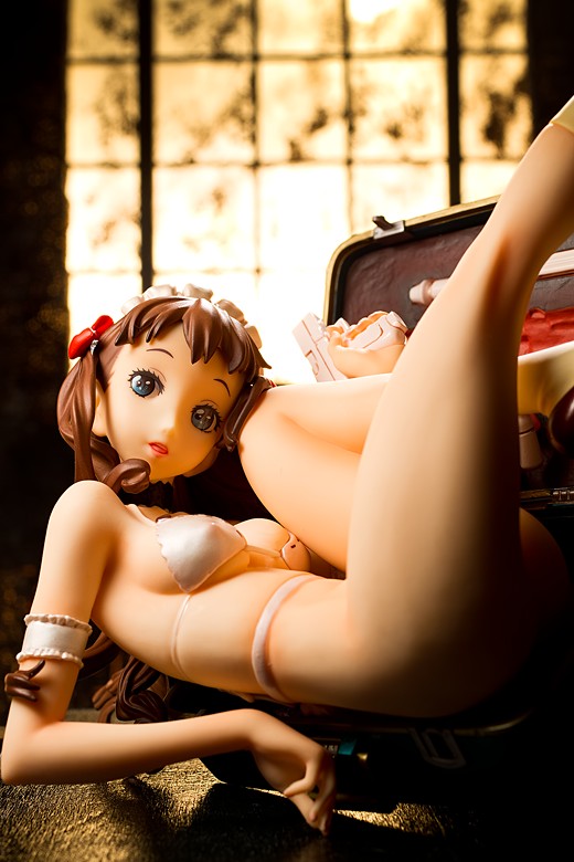
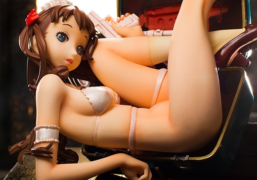
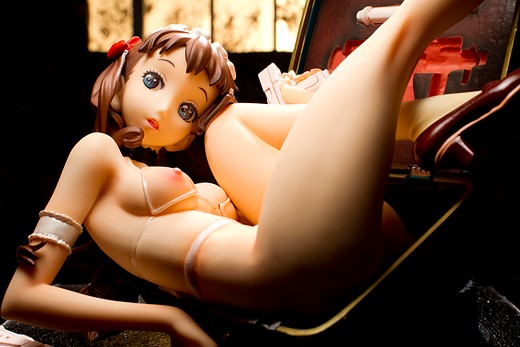
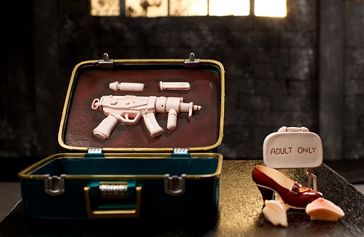
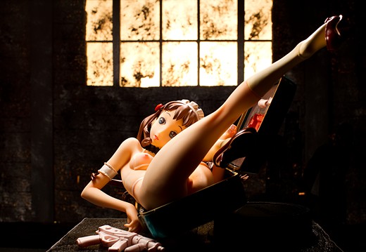
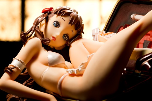
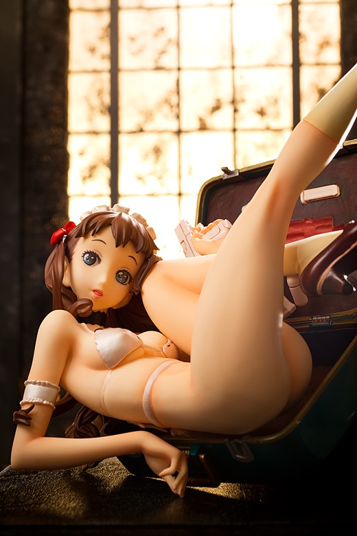
Trunk Girl is a 1/7 scale figure, just like Kotone Ousaka and Shoujo S & M (incidentally, I did not notice that their initials worked out that way until just now). As with most of Native’s figures, she comes with an assortment of accessories, including a couple of plastic guns, an extra clip, and something that looks like a Claymore mine. Her base is, of course, a suitcase, and it also comes with an angled transparent plastic stand, which I completely overlooked until just a moment ago. That’s a shame since I would’ve preferred to use that rather than the black lens cap I used to prop up the trunk during the photo session.
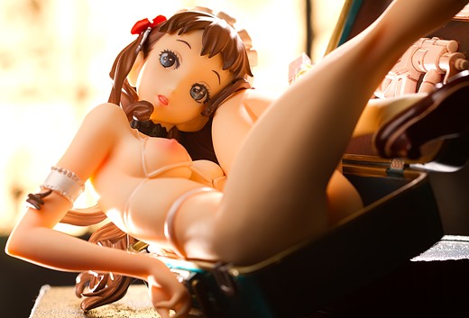
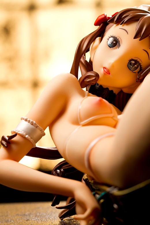
Nishieda’s style is often readily identifiable, and Native has done a fine job of incorporating his trademarks into this figure. Trunk Girl has a slender body, a rather large, bulbous head, high-positioned eyebrows, defined lips, and his typical circular eye style. If one is familiar with Nishieda’s work, it’s pretty easy to look at this figure and recognize where it comes from.
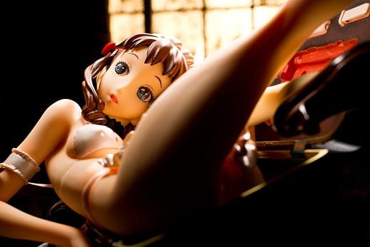
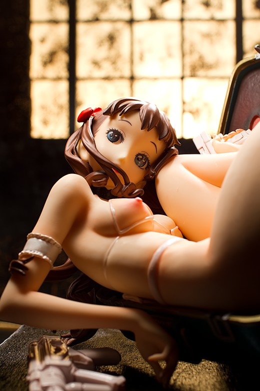
Though she’s apparently getting ready for a trip, she’s not going to passing through any security checkpoints given the heat she is packing. Her armament appears to consist of a couple of German guns, a Glock pistol and a H&K MP5, I think. I’m not much of a gun nut so I could be wrong on that. Both weapons are modelled in a very light pink finish, as they are in the illustration, and I’m not sure what the deal is with the pastel coloring. I think it looks a bit strange and that a standard black finish would’ve lent a humorous edge to the figure. Gun nuts will also note that she’s not adhering to basic firearm safety precautions.
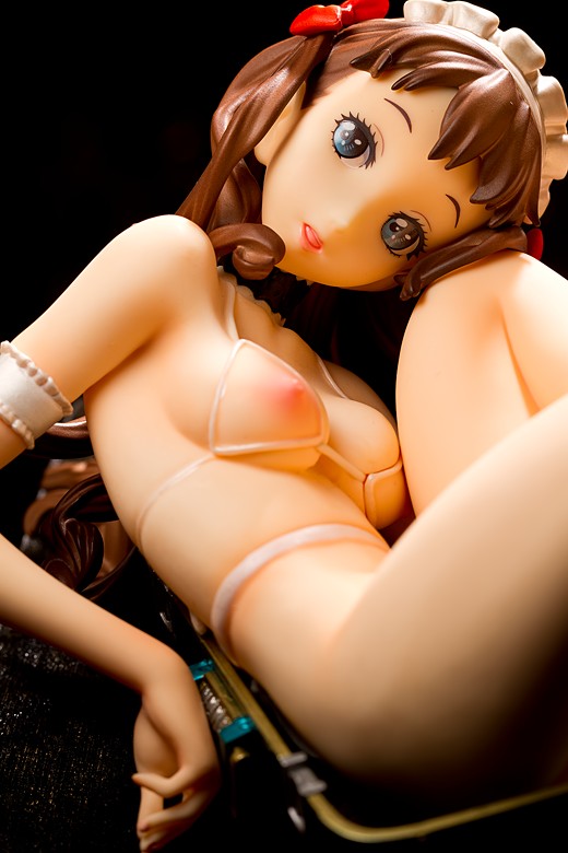
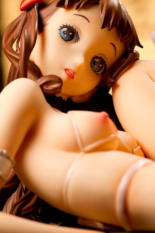
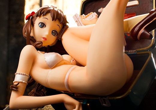
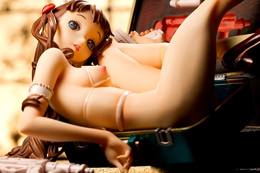
She’ll probably not be passing through any checkpoints in her attire, either. She comes basically naked from the start, but figure owners have the additional option of swapping out her bra cups for much more revealing ones. I think this is the first time I’ve seen a figure with individual swappable breasts, which is an interesting way to implement a castoff function. She also separates at the waist so that her apron can be removed.
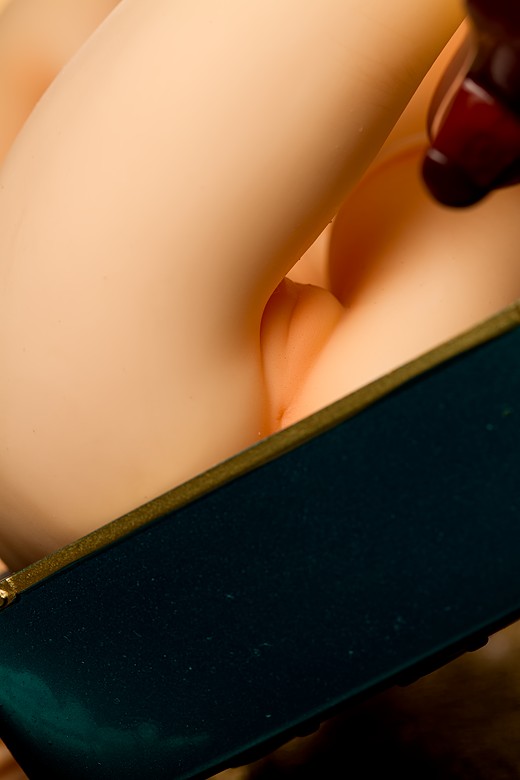
Like most Native figures, Trunk Girl features full anatomical accuracy, though she’s not nearly as in-your-face with it as Chie is.
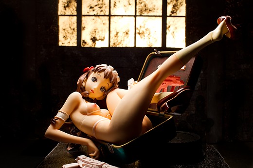
In particular, I really like her body sculpt; she’s slim, youthful, and feminine, and her body build is also a bit more realistic than that of a lot of anime-style characters. Her pose is rather unusual for an anime figure, highlighting aspects of the body that aren’t often noticed, like the backs of the knees and the areas below her armpits, and it’s a testament to how well this figure is sculpted that they look very natural. Her body position also focuses attention on her long thighs, which are thick and full despite her litheness.
I also like her hands; her right hand is dangling a bit nonchalantly, complementing her casual look. I heard somewhere that the face and the hands are the most expressive parts of the human body (a snarky wag might add the male genitalia to that list), so well-sculpted hands are very much appreciated.
Native is by far the best ero-figure maker out there, and Trunk Girl maintains their high standards. She’s sexy, unique, and isn’t wearing a lot of clothes, which is a significant improvement over a couple of other figures Native released in 2011. Their next few figures are looking excellent as well and I can’t wait for them.
super rats has a beautiful review of both Trunk Girl and Shoujo S up at HappySoda. I think that’s the only English-language review I’ve seen of this figure, but it’s a good one so check it out.
A logistical note: Native’s figures are technically Japan-exclusive, but US retailers seem to offer them regularly. I got this figure from Entertainment Earth for $156 shipped, which is a bit cheaper than it would’ve cost to go through a proxy service. On the other hand, I got the figure two months later than people who imported it. On the other other hand, I didn’t have to pay until the figure shipped nor did I have to use Paypal and their conservative exchange rate.


She’s quite pretty, though obviously not my kettle of fish as I have no real interest in ero figures. I don’t deny that Native do wonderful work, though; all of their figures impress me, I just wish they’d do some I could buy. ;.;
I like the staging you did for this shoot. Seems kind of apt for the sort of figure it is, an abandoned warehouse kind of look, which could go either way with the heat she’s packing, or the fact she’s in a box. I dig it.
Native and non-ero figures would be a strange mix XD They do actually do figures that you can buy, though; Native started off as a Max Factory imprint and I assume they are still the same company.
I didn’t have any ideas for photographing this figure when I got it, but eventually I came up with an idea with sort of a noir look with a wooden floor and a hard overhead light. I decided that wasn’t going to look too great because the floor would probably show a lot of glare and that wasn’t really the look I was after. I settled on this one after playing too much Fallout 3.
That’s awesome. 😀 Not a game I’ve played myself but I am aware of it, and looking at that screen, you really did a good job going for that sort of feel. Your lighting always makes me sad though, because I struggle so much with it. And I don’t even do multi shot reviews like you do, I generally just want one full body shot then a closeup, yet it’s still a pain lighting in a way that doesn’t make it just look really bland.
I’m still experimenting, and just today a new figure arrived (Mondays are wonderful) which I initially struggled to light in a way that pleased me at all, then I opted for a semi-silhouette attempt; http://myfigurecollection.net/picture/366207&ref=item%3A79735 — she is fully lit so you can see her colours, but softer than the backdrop which has a light right under it to really blow it out. It came out more or less as I had hoped. I know still very dull and boring compared to your kind of shooting, but I find it an improvement for myself.
Also dabbled a little with using a monitor as a backdrop, but glare and moire are a pain to deal with, I did get one that I think was okay-ish, but it’s of nendos so I won’t pain you with it. Something I should experiment with more, though, despite many people saying it is impossible or not worth it, I’m relatively happy with my preliminary results and think with practice it may yield good ones.
I really need some good resources on lighting though. ;.; Once I’m more comfortable and confident with it, then I think I could start doing some staging, though I’m incapable of making sets like yours, there are minor things I may be able to do. Or just stuff I can buy to build up a bit of a set… perhaps.
Every one of your shoots, even the more basic ones, make me a sad panda. Though I suppose I don’t put in a fraction of the effort you do, either. I guess you have to to get any good. 😀
I’ve been paying more attention to environments in video games, anime, and movies, since they often have to construct locations from the ground up and I can find a lot of inspiration there. It’s often hard for me to come up with interesting backdrops (you can sorta see that my main themes are the stony cave background, the Japanese background, the church background, and the abandoned warehouse background) so I’m looking around for some creative ideas.
Hooray for new figures! Particularly good-looking ones that don’t cost much money. I like the spotlight effect on the background, it gives off a contrast that pulls attention to the figure. One thing I’d recommend doing is pumping a little more light into her face; the face is almost always the most important part of the figure. It sounds like you wanted a lighting style with the light falling off further down her body, and there’s a couple ways you can do that: you can get a light really close to light up her head, and maybe flag it to block light from lighting up too much of her torso and legs (or you could use a highly-focused light source, like a flashlight or something), or you can feather the light by aiming it over her head and letting the edge of the light illuminate her face.
I’ve never actually tried using a monitor as a backdrop, though I imagine it opens up a lot of creative possibilities if you can get it looking right. I’m guessing it’s not impossible but it may be more trouble than it’s worth since not only does it seem problematic to balance the monitor’s brightness with the intensity of your lights, it also looks really, really fake when it’s done poorly. I know I’d do it poorly if I tried to; I can’t even take pictures of books without having massive glare spots. I’ve got a polarizer that I never use, maybe I should see if it can cut down on some of that glare.
Lighting is a tricky subject indeed, though I think the basics are pretty easy to understand if they’re explained well, and I’m hoping to contribute something in that vein in the close future.
Yeah, I’m using lamps not flashes, as you know, but I think I may need to make snoots or hoods for them for certain kinds of more direct light. I do get quite a lot of spill where I don’t want it sometimes, and as I experiment trying to be more creative and less bland I seem to encounter more issues.
Like using a monitor backdrop, spill is a problem due to glare even with my matte monitor, people with a gloss one can forget it. But if I can make hoods or something to channel the light or even just block it from going a direction or two it may help a lot. Light a figure as desired, then expose for monitor’s brightness, and see how I go.
I know there’s PPing tricks that could deal with some of the problems, but I’m trying to learn photography, not shopping. I’d rather get my shots right in the camera than have to PP a bunch, because it bores me and takes the joy out of photography, at least for me. Post-processing is just a chore, shooting is fun. If I can just shoot, resize and upload for web, I’d probably do a lot more.
I would very much appreciate any sort of tutorials or guides or any kind of educational articles you may do specific to figure shooting, especially on lighting, though I know you’re a strobist I think most of the technique can be extrapolated for my lamps.
i quite like her design as well as the whole “trunk girl” idea, however i do think that either a loli or a doll-character or a robot-character (or all of thsoe together) would fit the image of a “girl in a trunk” far better than this one here, partoicularly sicne it seems hard to imagine for her to fit into the trunk and then properlly close it.. but oh well, this is nice too^^ as of the upcoming native figures, im lookign forward to the princess morudina a preordered , shes quite gorgeous. i didnt preorder yoshii hitori, but i may or may not be gettign her, im really unsure abotu her. funny thing though that princess morudina, who seems to be more of a grown girl with a flat chest, is flatter than yoshii hitori, who seems to be a loli designed to fit into the “first sex in the school sport storage room” trope/fantasy. interesting! though both are original characters so apart from beeign fairly certain for yoshii, im not exactly sure if Morudina should be seen as loli or just pettanko; i might be able to tell that better once i hae her and can get a good look at every angle.
The funny thing is I think Yoshii Hotori is supposed to be a teacher, going by the image title.
I have the feeling that the Trunk Girl is sitting in the trunk mostly for comedic effect; I’m not sure how she could actually fit into it, unless someone came along and dismembered her body parts for convenient storage. Even so, I don’t think her head would fit; she’s got a pretty big head.
ah, she is? reminds me of komoe-sensei from to aru majutsu no index…
in any case, speakign of hotori, how do you like native’s newly announced igure? man, they sure seem to have a good run this year. so far they are makign three figures this year, i preordered morudina and im seriously considering hotori and the new one, elfriede. i really like the “military” look the black lagoon creeator gave her. i#d prefer a black uniform, more short/middle-long hair loli version, but the ay she is is quite nice too indeed.
I really like it. When I first saw it, I was kinda like, “Huh? Native’s making a figure of a girl in a full military uniform?” Then it turns out her whole uniform can be removed. I’m looking forward to seeing the angel girl figure too; when people talked about the figure based on Raita’s art, I was like, “Who’s Raita?” Then I remembered he’s the guy who did the Valkyria Chronicles designs, which I do like a lot, but then again, I’m still waffling on Alter’s Selvaria figure because of the odd, stretched-out body proportions, so I want to see the angel girl in her final form.
I’m not too keen on Trunk Girl myself. She looks fantastic as a figure. Her face in particular looks really nice. It looks bigger and rounder than your usual anime figure which works well for her. Her eyes are captivating to look at too. She’s not overtly explicit as well, unlike Chie. I’m just not so enthused by the idea of being crushed into a suitcase :lol:.
The pastel colour guns are quite odd I find, they look unfinished in a way. Surely metallic black or silver would have looked better? The cast-off is rather amusing. Full on breast replacement.
I tried to order a Native figure early last year, but it didn’t turn out so well. However I am hoping to pick up natives latest figure, Elfriede. Maybe a reputable store will launch pre-orders to make my life easier this time round.
I thought the suitcase thing was pretty strange at first, though I’m assuming it’s just a way for her to transport her guns, since there are spots for her weapons but it does not seem nearly large enough to fit a human, even one who is not wearing many clothes.
The castoff system does have a bit of a drawback in that there’s a small gap where the parts fit in. Maybe I wasn’t pushing them in hard enough. I thought the same thing about her guns too, that they looked like unpainted pieces from a model kit.
I was going to order Elfriede but, uhh, Tokyo Hunter is out of stock already. Oops. I guess I’ll hope he opens up orders again, or I’ll hook up with a different proxy; despite being nominally sold only in Japan, it’s not too hard to buy Native’s stuff.
I think it’s odd how those interchangeable breasts look. The “bikini top” version is OK, but the “spiderweb version”, leaving her nipples free, doesn’t fit into the line of her skin surface (Photo # 3).
Her submachine gun apparently is supposed to be an MP5K, although detailing leaves something to be desired. Fun fact 1: There was/is a ready-made arrangement available by HK which consists of an MP5K in a briefcase. It has a trigger mechanism in the briefcase handle and can be fired through a hole in the side of the briefcase.
Re the weapon color: I hear that light-colored weapons are the latest fashion in urban warfare. Viewed against lightly colored buildings, a light weapon color provides better camouflage than black. (Shiny stainless is a military no-go anyway.) Fun fact 2: Until a few years ago, the German gun law prohibited civilans to own “military-looking” guns. I won’t bore you with the details of this law, but the civilian semi-auto version of the then-newly-introduced G36 was required to have a specially designed plastic stock with a color other than black. It turned out to be light grey, and (see above) provided its owners with a weapon perfectly camouflaged for a civil war…
Yeah, the exposed breasts don’t seem to fit perfectly. I might not have pushed them in all the way, I guess; I’m pretty sure I did but user error is always a possibility, particularly since I don’t really like fiddling with figure parts.
Woooooo, Trunk Girl! She was sorta in my wishlist when I saw her prototype, but when I saw the painted version I found it didn’t appeal to me as much. Primarily, I liked the MP5K and the pistol, which I believe is a USP Compact. I also thought it might’ve been a Glock when I saw the sample images, but with your close-ups, I’m pretty sure it isn’t a Glock. Plus, Glock is Austrian, and if she has an HK MP5K, good chances are she has an HK pistol as well.
What kinda turned me off with this figure is the way she’s positioned and the way her eyes look. For some reason, her eyes seem lifeless, it’s like she’s a dead body stuffed into a Trunk (hence Trunk Girl). It just didn’t seem right to me. LOL
I sold my Shoujo S and M, kinda regret it now as they were excellent figures. But I’m looking forward to that Angel figure from Native (http://myfigurecollection.net/item/95937).
And yeah, Trunk Girl needs to work on her trigger discipline. =P
Actually, after a closer look, the pistol does look like a Glock rather than the USP Compact. Need more close-ups!! =)
And my eyes checked… @_@
I will take your word on that. I don’t really remember what a USP Compact looks like, being that I didn’t play a lot of Counterstrike. I lost a lot of my gun infatuation after getting older, though; growing up near an Army base when I was young, I loved guns, even though I couldn’t shoot worth a damn, but now I find gat obsessiveness to be completely bizarre.
…and maybe less spamming. XD
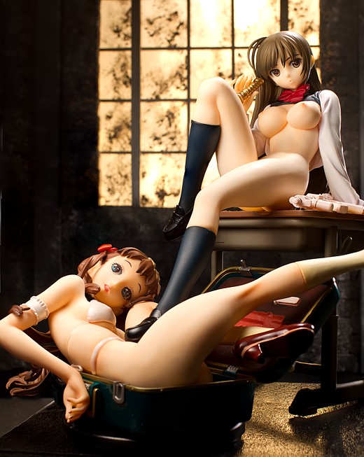
I regret not buying this one, she looks fantastic and makes for quite the subject to shoot. Excellent detail all around with a very interesting figure concept. The appearance of Kotone trying to push down Trunk Girl into the suitcase with her foot in #11 made me chuckle. Great job on the stained/cracked glass effect as well. Who ever said playing games wouldn’t pay off.
While Native promised us something new during Wonder Festival I’m guessing that promise held the colored version of Elfriede and sadly not the prototype of Cat Girl. Not that Elfriede looks bad or anything but the neko figure looks rather interesting though it’ll be tricky to pull off the face from the original source.
Trunk Girl was a bit difficult for me to come up with ideas for, and finally I was just like, “Ahh fuggit, I’ll put her in the warehouse set.” Cute girls always seem to look really good in crumbling warehouses for some reason. Now I’ve got a problem where I want to photograph Tamaki and I have no idea what to do for her. I’m probably just going to go with something really basic, like the white seamless backdrop.
Naitve showed off an angel figure which was sorta interesting, since I didn’t recognize the artist. It looked pretty cool though I think I actually liked Orchid Seed’s ero stuff the best. I’m really looking forward to the Toshihide Sano-designed figure.
I mostly love this figure. There are some things that just turn me off from it though. First is the mouth. It looks like she is trying to say something and to me makes it look really weird. Second, the open top looks like it isn’t in correctly, which I know you addressed in other posts. And finally the white that goes around her waist also seems like it doesn’t fit well. Maybe it doesn’t appear that way normally though.
Being anatomically correct is a giant plus though.
Yeah, the boob plates don’t seem to fit perfectly. I probably should triple-check and make sure I’m not putting them in wrong. The apron thing actually doesn’t seem to connect to anything, so it just loosely drapes over her groin; sort of an odd way to do it but at least it doesn’t require any fiddling around to get it off of her, which I think is also a giant plus. One reason I have yet to review Daiki’s Kaori Saeki figure is that I ripped the arm right off of her school uniform and I don’t feel like taking the time to repair it just for a couple of photos.
Do you have Nana in mind when you say that Native was a bit tame last year?
Im somehow glad that they didn’t make something too ecchi with their bathing Soniko 😉
Trunk girl is a very creative figure, the combination with the trunk and the guns inside looks very good, oh and I haven’t noticed the shoes before to be honest.
Personally I don’t like her body proportions, I like petite girls, but she’s just too skinny for her length. I can see that otherwise she wouldn’t fit in a trunk, but her body is just not what I would call sexy. Her castoff feature looks interesting and funny with the boob triangles.
Thats a nice background in your pictures, the dirty glass look, appears quite realistic, for my next review I will try to create something with a strip pole, mhhh…maybe I watched too much Highschool DxD recently ^^
Yeah, Nana, and a couple other figures they did that had topless options but looked much more like Kotobukiya figures than Native figures. I forget their names but I think they came from some eroge.
Yeah, she’s a slender girl; Nishieda’s style is a bit idiosyncratic and I can see why that might turn off some people; I had a friend say that her right leg looks all funky and I can see what he’s talking about. I don’t mind, myself; I’ve got a few figures with odd proportions and body builds that I like a lot. Such as gangsta lean Saber, who really, really needs a review already.
A stripper pole! A great idea, I had planned on doing that for that swimsuit Sen Tokugawa figure but then I decided I wasn’t going to take her out of the box so that I can sell her more easily on eBay later. High School DxD ought to have more pole dancing, I like the show a lot but the ED sequence is by far my favorite part.
Since you were going for a film noir motif, did you think of dropping out the color in the background to make it black and white and leave her colored?
I did not; I’m not a big fan of selective coloring and in fact, I was planning on writing a bit of a rant on this subject for an upcoming post that I’ve been thinking about. Now, I take a live-and-let-live approach to photography and I do my best to present myself as a nice guy on this site but the truth is, I am actually quite snarky and mean-spirited, and if I saw anyone perform selective coloring on a figure picture, I would heckle them mercilessly and without pause. Behind their back, of course, because I’m also passive-aggressive like that.
Understood…and I’d love to hear the rant.
>> Asa
Yeah, I highly recommend experimenting with flags and other modifiers; being able to control and shape light is probably the most critical part of studio lighting next to getting the desired exposure. Back when I used desk lamps, I often just grabbed whatever was handy, like pieces of black construction tape or cardboard (I never have a short supply of cardboard since I’ve got so many shipping boxes stored up) and taped them to the light as needed.
I think postprocessing is as much a part of photography as shooting is and I try to improve in both areas. I have zero problem with Photoshopping the hell out of one of my pictures – if it’s my picture, I frankly don’t care whether someone else disapproves of what I do with it – if it will bring it closer to what I envisioned. Generally speaking, though, my vision doesn’t include that overprocessed look (such as the Dave Hill look, which I’m not a huge fan of, though I know a lot of people are) or spending more time on a picture than I need to. I do think it’s a fallacy to insist on getting perfect images right out of the camera, though; if one is happy with how they look, that’s perfectly fine, and if one is too lazy to postprocess, that’s fine, but virtually all of the time, images are going to benefit from postprocessing time at the hands of someone skilled in using editing software. While I’m ranting, I sometimes see people suggest that postprocessing is somehow antithetical to the purity of photography (which itself is an outrageous fallacy) or that being satisfied with the images right out of the camera is a mark of a talented photography, which irritates the hell out of me. Whenever I see someone defiantly say, “Oh, I don’t like post-processing, that’s cheating,” I immediately assume they prioritize silly ideological conformity over getting better photos … kinda like when I see people say, “Look at this picture I took with a D3 or a 5D Mark II” or something, I assume they’ve got more money than talent because they have to impress people with the price of their camera equipment rather than the quality of their picture, and I haven’t been wrong many times. You know, this feels pretty good, I ought to write rants more often.
I hold nothing against people for post-processing, I just have little patience for it. Plus most tools for PPing photos are different to the tools I used to use when I could still draw, and I don’t really want to re-learn a whole bunch of tools. ;.; I can remember how to apply a soft focus effect in PS, and that’s about it. 😀
I readily crop. A fair few photographers (including my photography teacher) say you should frame it exactly and not crop, but I don’t see why. I’m shooting to upload shrunk to web, not for print. If I crop out white space or in order to zoom, or whatever, that’s my choice. ;.; I will do with my photos as I please, and naysayers be damned. Also I think figures are odd shapes and such so depending on how close I am and what angle I’m doing I will never be able to frame them properly.
But I do still want to learn to handle my camera better and get nicer shots (correctly exposed, at the very least) directly out of the camera, instead of relying on PPing tools, because I feel I will never improve if I just tweak contrast etc in every single shot I take. Baby steps, I suppose. Though I’ve had my SLR for about six months now, I should really be better than I am. Need to put more effort in to it and spend more time shooting instead of just reading and talking about it.
Fair enough, it does get annoying pushing around sliders. Particularly if you’re like me and you decide you want to adjust white balance on an entire batch of Tamaki pictures after already processing them in Photoshop, so that you have to re-do them in Lightroom and re-process in Photoshop.
I don’t crop as much as I used to, and I know at least one argument for not cropping (haphazard cropping can disrupt the perspective of the image), but i freely crop if I feel it will improve the image. The 3:2 aspect ratio of just about every DSLR doesn’t work too well for certain things, like headshots, so if a picture looks too elongated, I’ll go ahead and crop it to something like 4:3. I’m thinking about doing an experimental photo shoot with nothing but square images, just to get a feel for what they look like.
I think that’s pretty much the right path to take. From my admittedly-poorly-informed observations, I get the sense that many beginning photographers want to go from cluelessness to expert status instantaneously, and most of them seem to believe that buying more expensive equipment will allow them to do that. That’s a very puzzling attitude but it seems commonplace. Nobody has ever specifically asked me how to get better at taking pictures but if they did, I’d answer, “Shoot like a mofo.” That’s pretty much all there is to it.
Haha yeah, I see a lot of people get an SLR and expect to be all pro, then spend tons of money on lots of kit only to switch brands because the one they had “doesn’t take good photos” and such.
I understood that photography is complex, it’s part of the reason I didn’t want to cave and get an SLR, yet I was stupid and did. Now I’ve doomed myself to an eternity of learning. And I lack the ability to stage like you do, plus I’m far too unstable to shoot handheld so I can’t wander around and take random photos of stuff outside or anything either. Tripod+remote or bust.
Everybody I know who is good at photography, pro, ex-pro, good hobbyist, or whatever all just say shoot lots. Can only truly learn through experience. Go through shots, pay attention to histograms and get a feel for my gear and lenses, learn how to expose and compose through practice practice practice. Shoot like you have a minigun with unlimited ammo.
But I’m lazy; it takes a lot of effort to set up a shoot, and I have to pack stuff away once I’m done because cats will destroy things if not. So it’s a bother to do on a daily basis, thus I end up not doing it much at all. When I get a new figure I do a few shots of it, discard most and upload one (or two if it has an upskirt or sideboob) to MFC and that’s about it.
Not really the way to do things.
Dear Tier,
greetings from Germany. I`m collecting figures and anime-stuff for a few years now, when I got aware of your amazing blog. Found it, while I was searching for Kotobukiyas Kurisu Makise.
Think its needless to say, that you`re an excellent Photographer and subtle collector.
Inspired by TA im trying to put my collection into a blog-interface too, even i am not the best at taking nice photos with my old panasonic lumix fz30.
I set a Link into my blogroll and always looking forward to your reviews and shot breakdowns!!! (sorry for my limited language-knowledge)
Hi, thanks for dropping by! And thank you for the kind words. I hope you enjoy figure blogging and photography – it’s a ton of fun. And don’t worry too much about your camera, creativity and knowledge go much further than gear quality. Frankly, there are a ton of people out there with expensive cameras who have no idea how to use them.
>> Asa
Yeah, that’s always really funny, as is when people say they need to buy new cameras because they aren’t satisfied with the quality of the pictures of their current cameras. I’ve gone through one camera upgrade and my motivation wasn’t image quality; the biggest reason I wanted to upgrade from the entry-level DSLR I used to use to the one I use now is the viewfinder. The viewfinder is much larger and far brighter than my old Rebel XS’s viewfinder, and that in itself was nearly worth the upgrade. The other major reasons were the PC sync port, which the Rebel cameras don’t have, and the more comfortable ergonomics – the Rebel cameras are very front-heavy when using a substantially-sized lens. Image quality didn’t play much of a role in upgrading and I doubt anybody noticed when I switched cameras.
Everybody says that because it’s the correct advice. I don’t know if it’s the only way to get better but I think it’s by far the best. I’d add a note to that and say “Shoot to fail”; I learn a lot more from my failures than by sticking to what I’ve been doing. I ditched using a black cloth background a couple of years ago and I’ve learned a lot more about lighting than I otherwise would have; if I’d stuck with the black, I would’ve been playing it safe and I never would have learned anything.
I have a few different coloured sheets of card (A2 size which is restrictive at times but I can’t find larger locally) I use as backdrops — I gave up using my light tent with its cloth backdrops because cloth + cathair does not mix.
I do primarily use just black or white backdrops as it’s just… easiest that way. Using other colours introduces weird WB issues that I have no idea how to solve in camera and take far too much effort to fix in PP.
You really need to do some lighting lessons. 😀 Most stuff I see (and I actively search on a regular basis) is focused on entirely different types of photography. Figure shooting seems quite different. Perhaps it isn’t and I’m thinking about it all wrong, but I struggle with lighting anyway. I may well get two more manfrotto flex arms to replace the monopod and mini tripod I have for my lights; I love the one I have as it allows positioning much more easily. Though I wish they were a bit longer.
But given you do exactly the kind of shooting I want to, I’m all ears (or, eyes) for any guides, breakdowns and insight in to shooting figures. I guess it’s why I spam these review comments more about photography than the figures themselves. >.>
Back when I used desk lamps and posterboard, I found that colored backdrops were also really tough to shoot on. Red was particularly vexing, since I always got these weird skin tones. Curiously, I don’t have many white balance issues using flashes, even though I often use colored gels.
You may get your wish – I’ve been planning to write something on that subject. Though that plan has been incubating for well over a year now with most of it written only in my head.
I always recommend getting grip gear; light positioning is really important and doesn’t get nearly the level of consideration that it should (almost every figure photographer wants to talk about cameras and lenses; some people want to talk about lighting; few people want to talk about modifiers; and almost nobody wants to talk about grip gear). It’s good to hear that the Flex Arm is working out well for you, because otherwise I’d recommend the Magic Arm, except that costs at least $120 US for a full assembly and that is a helluva lot of money to spend on something to point a light in a certain direction.
Well, my flex arm + clamp ended up costing $100. $50 for the arm and clamp, then $51 shipping. I won’t be doing that again any time soon; gonna wait until I can buy a bunch of stuff at once, since shipping costs don’t go up much ($50-70 it seems regardless of how big my cart is, eg two flex arms, clamps, a macro rail and a quick release head for the rail costs $67 to ship. Damnable pacific ocean. But anyway, this sort of stuff may be better suited to your new breakdown as I already commented there and it’s all about gear instead of figures. 😀
Ya know, Native does good work and I always found myself wanting to see what they have up their sleeves. However, none of the figures in the past year meet my bishoujo standards so despite how every other aspects of the figures look, I just couldn’t bring myself to get it. As for this trunk girl though, the face seems a bit weird for my personal taste; but then again, it’s straightly personal~
Yeah, I have the sense that Nishieda’s style doesn’t lend itself too well to figures. Kinda like redjuice’s style; Lacia’s sculpt is pretty accurate but I know some people aren’t too enamored with her face and I can see why (and I can also see why the Guilty Crown animators basically dumped his style for the anime).
Pingback: Violet (18+) « EmencyBlazer Works