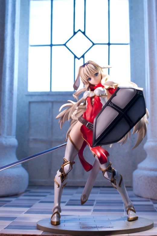
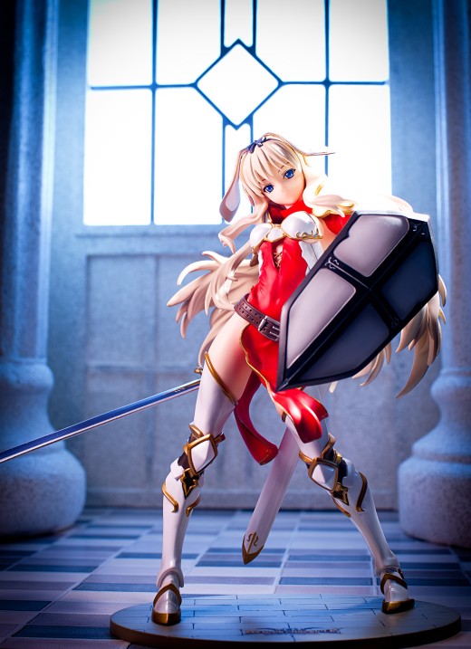
When I shoot figures, I try to come up with an idea that will make them look interesting. My ideas often fail; sometimes they’re beyond my abilities to create, sometimes they don’t look as good I had hoped, and sometimes some unforeseen problem comes up that prevents me from getting the picture that I want. However, with Sasara, I mostly got the pictures that I had hoped to get which, frankly, surprised the hell out of me. They weren’t all exactly what I envisioned before I started but the general look and mood were close to what I was trying to achieve. Here’s how I made the first shot.
The Idea
I’m fond of church or temple-themed backdrops, particularly for armored fighting girls. A couple of years ago, I came up with an idea for a backdrop with a giant stained glass window, and I planned to use this for Daiki Kougyou’s gangsta lean Saber. Time passed and eventually I used a scaled-down version of the idea for the Saber Alter post. Needing a new idea for Daiki’s Saber, I thought that a church interior backlit by a large, ornate window would look cool. I waffled on constructing that set until I got a shipping notice for Sasara, and then I decided to appropriate that idea for the To Heart girl. At this rate, Saber is never going to get a review, but she sure does come in handy in inspiring ideas for other figures.
In my mind, I was thinking of something dramatic, with Sasara standing out from the background. I felt that controlling the lighting would be the most appropriate way to center the point of interest on Sasara, and I knew that I wanted a strong overhead light shining down on her. In the RPGs I’ve played, paladins have always had a strong association with light; one of my favorite spells in Everquest directed a beam of light from the sky to the target, like a divine spotlight, and in World of Warcraft, the word “light” is overused to an almost comical extent. But although it may be cliched, I wanted Sasara to evoke that archetypical knight-in-shining-armor look – even though she’s not really wearing much armor.
The Background
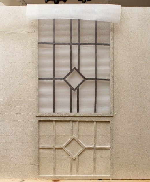
The set is constructed out of some wood sticks and panels that I had laying around. I think I bought these panels to construct a set for a different figure – I’m not sure which one it was, I’m guessing it was Daiki Kougyou’s Tsuneko – but I figured I might as well use them for Sasara. I had been shopping for adhesive window film for a different idea, and I came across this product on Amazon; the pattern didn’t work so well for that other idea, but I liked its centered-diamond motif, and I decided to base the window design off of it. Needing something to make the wall look less boring, I glued down some basswood sticks to mirror the pattern below the window to give a bit of symmetry, hopefully making it more interesting. Probably the most difficult thing about building this set was getting everything aligned, particularly with the diagonal cuts necessitated by the diamond shape. Better tools helped, though; I got a tool called the Easy Cutter from the local hobby shop and it makes cutting stripwood much, much easier than when I used a pocketknife or a handsaw. The window is covered with some very thin white foam sheeting to diffuse incoming light. The last thing I did was to cut some grooves in the wood panels to simulate bricks, but they don’t show up at all in the photos, and that’s just as well because I did a terrible job of it – all the grooves are wavy and crooked since I had a hard time controlling the Dremel.
The floor is just a cheap two foot-square panel of wood I got from Lowe’s covered with some Contact-brand shelf liner paper. I’ve used this same panel for Dizzy’s and Sigui’s reviews, and it works pretty well for sets like this one. Finally, there are a couple of big plaster pillars there, and I got those from an arts and crafts store for about ten bucks each. For that price, they look pretty good. I painted everything with a stone-textured spray paint, and though it looks better than it would have if I hadn’t used a textured paint, the grit is a bit coarser than I prefer.
Lighting
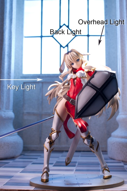
I didn’t think to take a picture of the setup, but it’s not necessary since the lighting is straightforward. The key light is a 580EX II flashgun at camera left, firing through a LumiQuest Softbox III. At about 72 square inches in area, the Softbox III is a small modifier by human standards but for small objects like figures, it generates very soft light. It’s positioned fairly close to Sasara for greater light falloff and to limit spill onto the background.
There’s also an overhead light, a YN-560 flash fitted with a homemade gridspot that is above Sasara and a bit to her left (that is, towards the right side of the frame). It’s firing at her hair, which is why it’s blown out. Finally, there’s a couple of flashes behind the window to ensure even coverage of light with no dark spots.
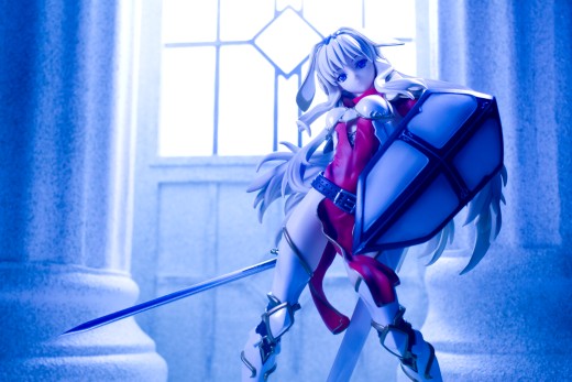
One other thing to note is that to get the blue color in the background – as the wall is obviously not painted blue – the white balance was set to a color temperature of 2900K. A light source at 2900K gives off a very orange light, so setting a white balance at that temperature imparts a blue cast to the image, cooling down that orange light and thus correcting its color. However, flashes and daylight light bulbs give off light at a color temperature of about 5200K, and setting a white balance of 2900K retains that blue color rather than correcting the color, like so:
So now I’ve got that blue background I want, but now I’ve also got a blue figure, which I don’t want. So what I did was place some CTO gels on the key light. A gel is just a colored sheet of plastic, and a Color Temperature Orange gel is, as one might imagine, colored orange. CTO gels come in varying opacity levels – typically 1/4, 1/2, and full strength; in this case, I stacked a full CTO and a 1/4 CTO together to get the color I wanted.
There we go – the CTO gels on the key light neutralize the white balance so that Sasara is colored more or less correctly while the background is still blue. I’ve got a flag on the Softbox III to cut down on spill on the background, but if you look at the pillar on the right side of the frame, you can see there’s just a bit of orange tint running up its side, and that’s because of some light spilling off that key light. It’s not a big deal – I could correct it in Lightroom or Photoshop later, but it doesn’t bother me.
Incidentally, if your camera does not have selectable color temperature in its white balance options, the tungsten setting is equivalent to around 3200K, and you can tweak that in Lightroom, Aperture, or Canon’s Digital Photo Professional. Also, I have no idea whether gels work well with desk lamps; I’ve used them with continuous light sources before (the first shot of my Fate Testarossa post was taken with a CTO gel taped onto a bluish LED work lamp with the zoom racked during exposure) but never with something as large as a desk lamp.
Post-processing
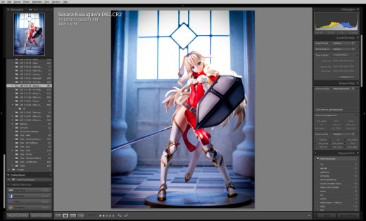
I always post-process my images. Every shot I put up here gets run through Photoshop at the minimum, and in recent months I’ve incorporated Lightroom into my workflow and as I learn more about its capabilities, it’s become more and more vital to the way I process pictures.
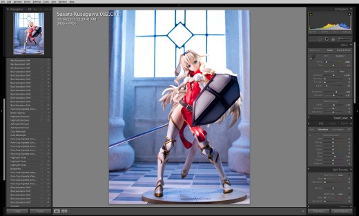
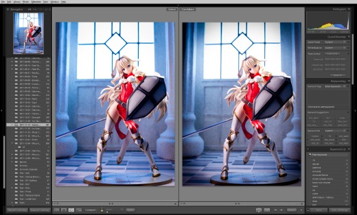
The first thing I do is import my images into Lightroom. The image above shows the way the picture looked upon import, with the basic settings Lightroom applies by default. In Lightroom, the first thing I like to do is tweak the exposure controls until it looks right to me. Lightroom gives you a ton of controls, and I usually like to increase exposure – since I tend to underexpose in-camera – and darken black levels. For this image, I also want to crop the picture. Since I switched my lighting system to flashguns, I prefer to compose in-camera since I don’t use a tripod very often anymore, but I obviously need to crop because the edge of the floor is clearly visible. I also want to take a little bit off of the top to give the picture a more balanced look.
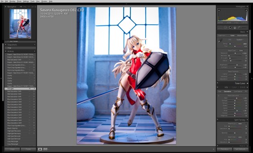
Here is the picture after cropping. I think the composition works better without such a vertically-stretched feeling. I’ve also increased the blue saturation level a bit.
I decided I liked how increasing the blue saturation level looks, so I increase it even more, and I also boost up the red saturation level. I want to deepen the color of Sasara’s dress to contrast with the background. As the only red element in the picture, I’m hoping that it’ll be the first thing that the viewer looks at, and so I want it to stand out sharply.
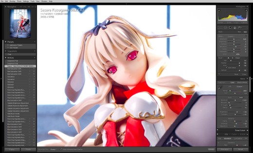
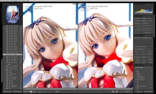
The eyes of a figure – or a human – are extremely important and so for this picture, I’m going to spend a little more time on them. Using the adjustment brush tool, I’ve painted over the eyes – the red areas mark where I’ve painted – and I’m going to increase the color saturation of her eyes, like so:
On the left is the original file and on the right is the image as it has been processed up to this point. Not only are they brighter, their blue color is more pronounced.
I’m pretty happy with the image as it is now, but then I decided to see whether I wanted to add a vignette. This is something I’ve been experimenting with more frequency as I become more comfortable with Lightroom. A vignette directs attention to the center of the image and can increase drama, but there’s a real risk of overusing it or overdoing it or using it inappropriately.
In this case, I decided I liked the vignette – Sasara and the background are fighting each other for the viewer’s interest, and darkening the edges makes sure that Sasara remains the main focus of the image. In addition, I think it evokes a more intense mood that fits better with what I’m trying to achieve with this image. With the vignette, Sasara takes on more of that shining knight look that I want.
I then export the image as a TIFF file and load it into Photoshop for final tweaking. I have an action mapped to the F2 key to resize the image, create adjustment layers for levels, curves, color balance, brightness and contrast, and hue and saturation, and to sharpen the image, all in one keystroke. In this case, I don’t need to do much, and most of those adjustment layers went unchanged. I did increase the global color saturation to give the image a more eye-catching look; this was very unusual for me, because I typically don’t do this much saturation adjustment but I felt it improved the appeal of this particular image. Finally, I increase the red color balance in the highlights by +4 just to help Sasara’s skin tone a little. After that, I save the image as a PSD file for archiving and as a JPG for uploading to my website.
The Things That Didn’t Work
I’m satisfied with this image but there are a lot of things that didn’t work out as planned, or that I overlooked and don’t like. One of the effects I was really hoping to get was shafts of light radiating out from the window, and I lit a couple of sticks of incense to try to generate that look. Unfortunately, the light coming through the window is so soft that it just washes out the smoke, and I wasn’t enthusiastic about trying to increase the amount of smoke by lighting ten or twenty sticks. Maybe I’d have better luck with dry ice or a fog machine.
I also would have liked it if the background had a brick texture. Before I built the backdrop from wood panels, I had thought of using some hobby bricks to build the wall, as I did for Saber Alter’s set, but I was far too lazy to do that. I did try to cut in some grooves to simulate that texture, but it looked very bad, and it’s probably for the best that they aren’t visible in the images.
One detail that I should have noticed was the gap between the wall and the floor. I really wish I’d figured out a way to get rid of that; perhaps I could have used adhesive putty to fill it in or clamped the wall to the floor.
Final Notes
I should mention that this picture didn’t take me very long to shoot or process. I knew I wanted to give Sasara a more heroic and intimidating look, which meant shooting from a lower angle to give her greature stature. I wanted to give a greater sense of depth between Sasara and the background, which meant using a wider lens than the 100mm macro lens I usually use. I wanted a blue background which meant shooting on a tungsten white balance setting with the appropriate amount of CTO gels on the key light. I wanted the backdrop to have a sweeping, life-sized look – very difficult to do in my limited shooting space – so I left more room above Sasara’s head than I typically do. But I wasn’t really thinking about any of these things when I shot the picture – I’ve shot enough photos that I can make those decisions based on experience. That’s really the key to getting better at photography, I think; you can buy an expensive new camera or a lens with a red ring around it or a battery of Broncolor heads, but none of that is going to help you get better. The best way to improve is to shoot, look at your images to decide what you like and don’t like, shoot again, try out some new things, and shoot some more.


Nice breakdown, dude! I tend to be lazy and take the easy way out through using photoshop, but it’s good to know about the real-life lighting techniques. Sweet job. Gonna post this on Anime Figurines Network.
Thanks XD I’m pretty bad at blending images together in Photoshop. I’ve tried it on occasion and every time I do, it looks fake as hell (it doesn’t help that I didn’t learn what a layer mask is until last year). Though I’ve had more than a few real backgrounds that looked fake as hell too, thanks to sloppy lighting control on my part.
Photoshop not tough, just don’t concern yourself with what you don’t need. Blending images requires some forethought (I have used it since 1st beta, taught it for awhile). Many of the images I do are nearly the opposite of your approach, interestingly. I capture light layers and composite them the way I wish. Masking is quick, there are many methods, I shoot on black backgrounds for many reasons (spill mostly). Once masked, an image can be manipulated a million ways, like quickly adding “glow” or rim light in 2 seconds. I don’t do a lot of dodge and burn, but it is easy too, and basic darkroom stuff like from the old days.
Mainly its keeping perspective angle and lighting in mind, and a composite is quick after that; mask, soften edges. I typically use LED light or natural light, and remote capture into PC.
–
People talk (example; Asa’s comment) about “over processing” but the fact is – Pshop is merely a digital darkroom, as photographers having been doing it (developing images in the darkroom and processing them) since photography’s invention. The painful truth is this: You are spending time to craft an image, whether you want to do it in camera and tweak settings, set up a complicated backdrop or use software is merely preference, its all still time. There is no right or wrong here, just choice and preference.
For myself, the lines blur between ‘processing and ‘photo manipulation’.
You spend way too much time post-processing. 😀 I’m far too impatient for all that. I usually import raw to photoshop, tweak exposure and colour balance a little in the raw dialogue, then levels and saturation in photoshop itself, if necessary. Crop, resize and done. Never do any of the fiddly work you mention; I’d get sick of it pretty quick if I had to do all of the above for every shot even, let alone what you do.
I suppose that’s what separates you from us plebians though. You’re much more dedicated to posting perfect shots, where as most of us have a more “That’ll do” attitude. Which is fine for mass shooting on sites like MFC or wherever else, but we need shots like this to rise above the masses.
I am a big, big proponent of post-processing. Typically I don’t spend more than a few minutes per picture; this one took a lot longer to write about than it did for me to work on it. It took me a while to figure out a workflow that I’m comfortable with, but now that I’ve got most of the details worked out, I can usually do most of this stuff without too much thought. At least, I don’t have to think too much for pictures intended for web display; however, I spend way, way more time working on pictures if I plan to print them, since I can’t fix them up after I’ve paid for the prints.
Just did a shoot, took 58 shots of a figure, didn’t like any of them, and threw them all out. Really glad to see this post come up, it gave me some ideas to try out!
That’s always fun, shooting a bunch of pictures and realizing they are all junk. I haven’t spiked a whole photo set in a while (not counting Miku Append’s shoot, which was mostly experimental) but I used to do this with great regularity when I was trying to get away from shooting on full black backgrounds. I look forward to seeing your shots.
Thank you so much for this photo shoot break down. I am glad I was able to see how you made this scene for this figure.
As per usual you did an amazing job with this shot. I would love to see more breakdowns when you have time!
Thanks! I’m planning on doing a Miku Append one a bit later; I did remember to take some setup shots there so it should be more comprehensive. And humorous, hopefully – that shoot actually went mostly as planned but some interesting things came up that were sort of funny.
Ah you processed the eyes after masking them, looks very nice with more saturation.
My post processing software also provides a similar feature, but I haven’t tried it so far.
I always post process the image as a whole, well sometimes I clean some dust spots, but not more than this ^^
Yeah, that’s not something I do often (mostly since I try to work fast) but if I have a picture I really like, I’ll put more effort into it than I otherwise would. I also didn’t actually know how to use the adjustment brush in Lightroom until recently, so my post-processing workflow is in flux as I get more comfortable with using both LR and Photoshop.
They do look good.
So…much…processing. I’m still at the stage where, for the vast majority of my pictures, I just play with a few sliders in Lightroom and for a few photos I’ll go into Photoshop and try some Topaz filters. I have been noticing that I’ve eventually been learning to use more sliders in Lightroom in my routine though.
Your dedication to building sets is impressive as well, do you end up recycling a lot of set materials between shoots? I recognize the pillars but does the wood backdrop get reused too?
Ha! You should see what I had to do for those Miku Append pictures with the splashes and stuff. Or some of the pictures I had to rescue because I’m a nincompoop and screwed up while shooting. This picture didn’t take me too long to process though – it took me a lot longer to write about the process than it did to process it. It’s easier for me to process a picture and get it to where I’m happy with it if I had a vision in my mind as to what I wanted it to look like. Unfortunately that doesn’t happen too often.
Yeah, I re-use set parts quite a bit. I used the same wood panel for both Cryska’s and Yui Takamura’s shots (albeit repainted). Dizzy’s set basically got recycled to make the wall I used for Rin Tohsaka’s and Ivy’s set, and I’ve got this big-ass cave-looking thing that I must have used for at least a dozen posts. I’m going to reuse this set as well, probably when I do my annual end-of-year favorites list, assuming it hasn’t been damaged by then. Which it might cuz I used balsa wood for the window beams and that was a really dumb choice on my part, because they snap very easily.
Reading about the lighting setup I found most useful – or more accurately how you balanced the blue and white with minimal spill. That’s probably the toughest part I find when setting up to take photos now. I’m always finding managing shadows, light structures, background spill and reflections the most difficult. It’s not helped by only ever having access to 2 lamps with various LED bulbs for main lighting and single RGB LEDs to throw colour tints around.
I’m planning to build a high power LED light thing-a-ma-jig to resolve this issue somewhat. I’m doing it more to learn about CC Power Supplies, Regulators and Temperature management – but the byproduct will hopefully be a high power LED set-up that I can use alongside or in place of these crappy desk lamps I have. Plus if I can make one and it works I can make as many as I need in the future. However if you never hear of this project again it failed :P.
It took me a long time to figure out how to restrict light, and it’s something I still have some difficulty with, which is rather strange because the best thing to do is to lean a piece of rectangular cardboard or something to block it.
That sounds like a pretty cool project though I have to be honest, I read a lot of people getting excited about LED lights and I have no idea why. Light is light; it doesn’t really matter if it’s coming from an LED light or a flash tube or the sun, the same physics apply for getting the light that you want.
Yep, I like your final notes there, which says it all. You really make me wish I wasn’t so lazy (speaking of lazy, too lazy to comment on previous post, I love how Append looks in those shots). I kind of had the same reaction with Black Gold Saw and expecting more reviews…while not reviewing it myself. I love the figure (hot pants).
I almost always take a pass at a figure’s eyes. Sometimes it’s hard to tell, because I try not to bring them out too far. It’s pretty much the most processing I do…I actually just hit Auto-Adjust 95% of the time and maybe put some sort of filtered duplicate layer on top. Also, desk-lamps can be difficult to get tight focused beams, so I will make the spotlight adjustments in Elements rather than lighting something that amounts to a 1/3 stop adjustment.
I’ve only recently started using vignetting. It’s one of those things that gets over-used, but can really make an image outstanding when applied.
Auto-Levels and Auto-Color used to be a huge part of my post-processing routine, particularly when I used fluorescent lights and I could never quite get rid of the greenish tones (in retrospect, I probably could’ve just gotten a gray card or something to manually set white balance). After I got Photoshop CS5 (thanks to a family member enrolled in an institute of higher education), I switched over to using adjustment layers and I really wish I’d done that earlier because it’s a lot easier to go back and change things. When I was preparing some pictures for printing, it was pretty annoying trying to figure out what I did on certain pictures because I used to save the prepared images in PNG format.
I have the sense that I’m going to overdo vignetting on my pictures but I really like the effect, so I’m comfortable with that. I figure it looks less wonky than microscopically-thin depth of field, which is still one of the things that really bugs me in pictures.
your shots really sets apart from “just another figure photo”. From planning to execution, it requires a massive amount of patience to make it perfect. I guess you shoot a bunch of photos, review one by one, sort, edit, delete and reshoot some more. Then rinse and repeat.
Thanks XD Figure photography is just a hobby of mine, but I try to get the best pictures that I can. I’m not a particularly disciplined person, but I’ve found that learning more about composition, lighting, and post-processing has helped me far more than inconsequential stuff like reading gear forums.
Wow. All of this hardware… I feel such a noob. I would just shoot a picture and do almost everything in PS. But then, my specialty is computer graphic and I’m just an average photographer.
You’ve got all of my respect for placing so much emphasis on the pre-post-processing (hey, I thought it sounded funny) part.
As for rays of light – either you could use some semi-transparent foil or paper for that window and then put some strong light through it (which I’m pretty sure would ruin the picture), or just fiddle a bit in Photoshop.
The Photoshop option would probably be best, I think. I had some translucent foam material over the window to spread the light out (and to hide the flashes, which were just piled up on each other behind it), but there wasn’t anything in the air to catch the rays of light. Maybe a smoke machine … though that might set off a smoke detector and I’d feel quite the fool if the fire department came and bashed down my door while I was shooting pictures of little girly anime figures.