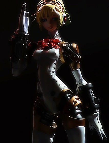
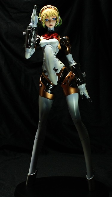
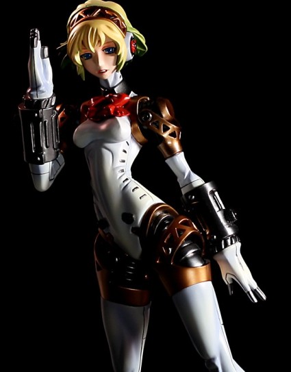
I recently spent some time practicing my Photoshop photography skills, and I shot some new pictures of Aegis and Rei. My Aegis photos were one of the earliest photo shoots in which I played around with shadows and a black background. I liked those photos a lot at the time and in retrospect, I can’t quite remember why:
I really am not digging the folds and creases in the background. It makes me want to re-shoot pictures of every figure I reviewed using a cloth backdrop.
I like my new pictures, but I wonder if I’ll look back at these photos a year or two from now and think, “What in the world was I doing? C’mon man.”
Here’s one more image that isn’t quite as dark as the first:
Rei was one of the earliest figures I photographed, and I was still using a ragged blue curtain then as the background. I also used three lamps, one shining from each side and a third illuminating from above. It made for a lifeless photograph, as if Rei were nothing more than a chunk of molded, painted plastic:
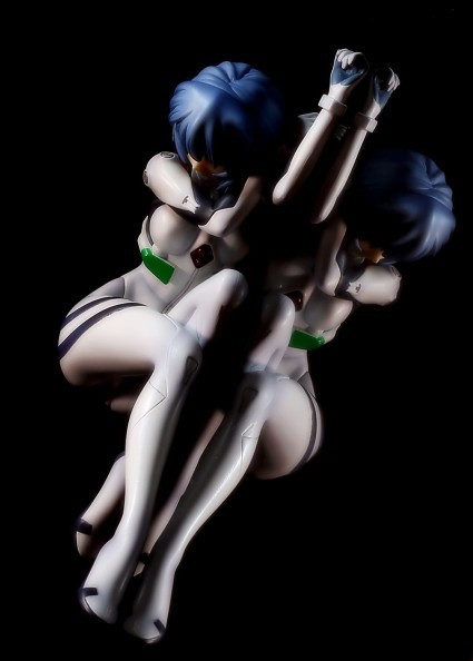
How boring is that? Really bloody boring. Rei’s an albino clone girl who slides herself into a tight bodysuit to fight off huge monsters bent on genocide in an apartment-sized robot; she shouldn’t be boring. I think my new pictures are more interesting than my old ones, even though I don’t really have any clue what I’m doing. They’re probably not quite as useful from a review perspective, but I’m comfortable with making that sacrifice in the name of prettier pictures.

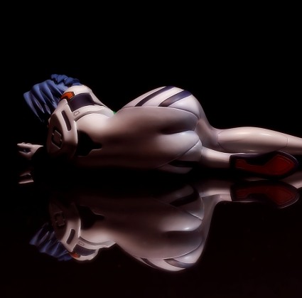
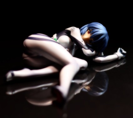


I just got this Rei version too like a month ago at a discounted price. Your new photos of her are definitely nice. I particularly like the reflections.
I don’t know about Aegis. She doesn’t interest me, probably is her face. She looks sad 🙁
But again, I must say your new photos are very much better than the old ones. GREAT WORK!
I really like this Rei figure, although I wish it were a bit bigger. Like 1/6 scale. I wish that every figure were in 1/6 scale or bigger.
Yeah, this version of Aegis takes quite a few liberties with the character design XD Particularly with the proportions. I kinda like how she can look like she’s sad or smiling depending on the light, though.
And thanks for the compliment! My cheap poster frame plastic cover is the hardest-working cheap poster frame plastic cover around.
Really nice figure. I love your atmosphère, and particulary that of Rei. I saw your picture on Tsuki-Board, and I was impressive by the miror effect. Two really nice shooting ^^
Love the shots of Aegis!
When we look in the past and look at our first photos of which you were so proud of, you got a glimpse of our evolution.
By practicing, our eyes can spot defects quicker and you said to yourself : “OMG, how could i take those shots…”
Your evolution is excellent and that can be feel in your last reviews.
I enjoy your dark style, who’s kind of your signature.
Rei photos are superb!!
>> Leonia
Thanks!
>> Ashlotte
Thanks to you too! I think I need to re-shoot Exelica in this manner, too.
>> Lylibellule
Indeed! I keep my old photos around even after I replace the links on the individual reviews just so I can look back at them later and gauge how I’ve progressed.
I do like the dark XD Admittedly, one of the big reasons I take darker pictures is so that my mistakes are obscured <.<
Aegis, sweet Aegis…
Hot Damn! Those new Rei shots look so smoking hot!
How did you achieve that effect?
I still didnt review her since I couldnt figure out a good way to shoot her since pictures turn out boring
The mirror effect is just a piece of transparent plastic (a poster frame cover, actually) that I put on my desk, over a piece of black posterboard. In retrospect, I think red posterboard would’ve been a better choice, since I’ve seen a lot of promo art where Rei has this dark, red tint to her.
I’ll happily admit that the shadows are massively enhanced by Photoshop XD I usually do a levels adjustment and contrast increase on all my pictures.